case studies
The case studies assembled make up a range of buildings that we’ve explored illustrating a spectrum of design tactics, solutions, and changes.
The information and photos on the website provide a glimpse of the projects. Each study contains an introduction and a few attributes (e.g. location, completion date, area) to give you a feel for the project. For additional information on a case study please feel free to contact us. More information is also available in our publications and upcoming Adaptable Futures book published by Routledge. You can filter case studies by location, building type or one of the six AF design strategies.
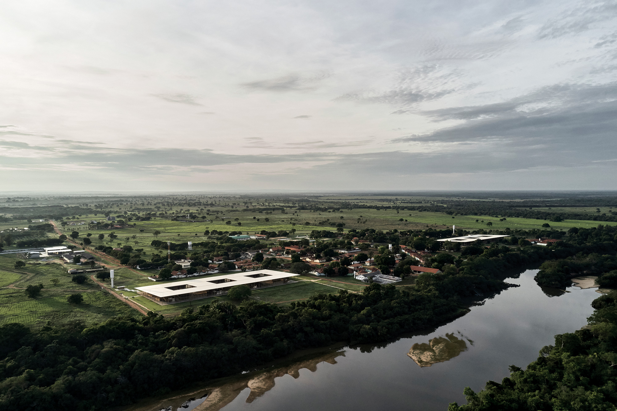
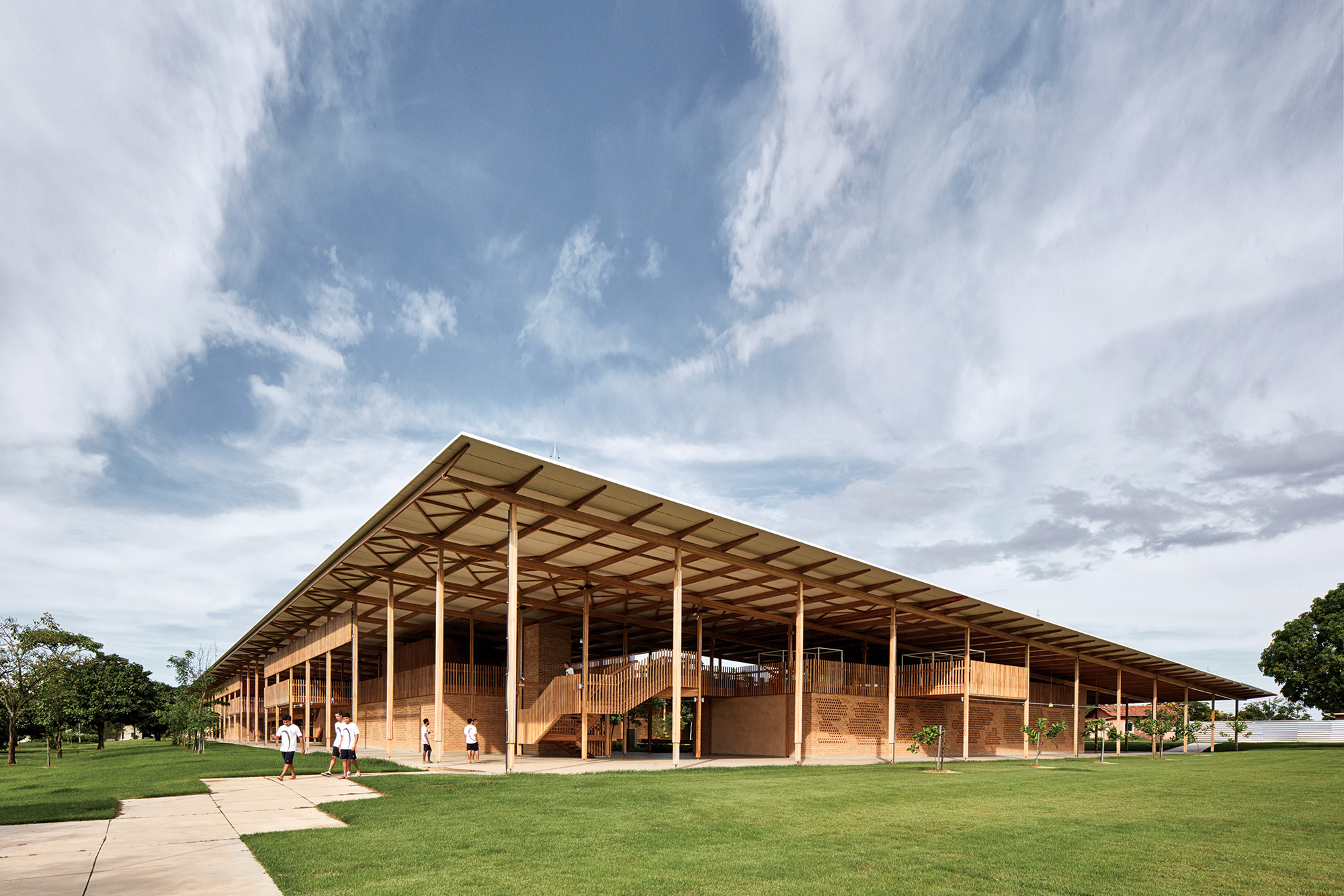
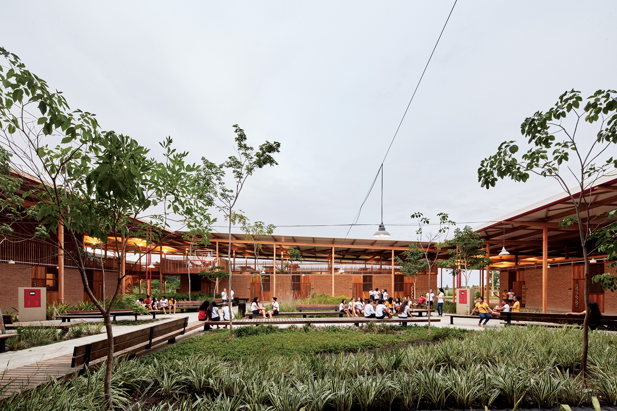
The Children’s Village is located in Formoso do Araguaia, a small city in the middle region of Brazil. The project is a village for children from 13-18 years old of the local school Canuanã. The concept was to promote the regional culture through the building’s design with local construction techniques, as the use of a timber structural system.
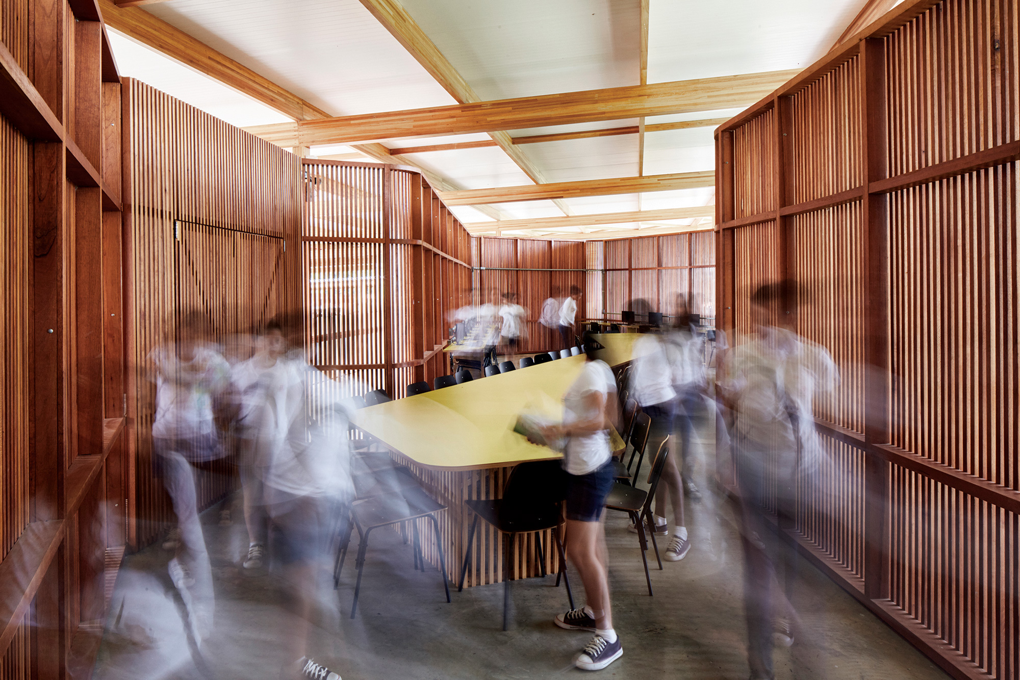
The building’s aesthetic is highlighted by the simple form which consists of a large roof that connects different volumes and also protects the facades from solar exposure. The volumes configuration promote an open plan and internal gardens that potentializes the connection with the natural environment. The volume’s design and the use of ‘cobogós’ on the walls (perforated elements) provide natural ventilation into the internal spaces.
The project conception was highly influenced by the design process, where the architects integrated the students and other school members into discussions and activities to capture the demands and desires for the new village.
Images courtesy by the architect (Gustavo Utrabo).
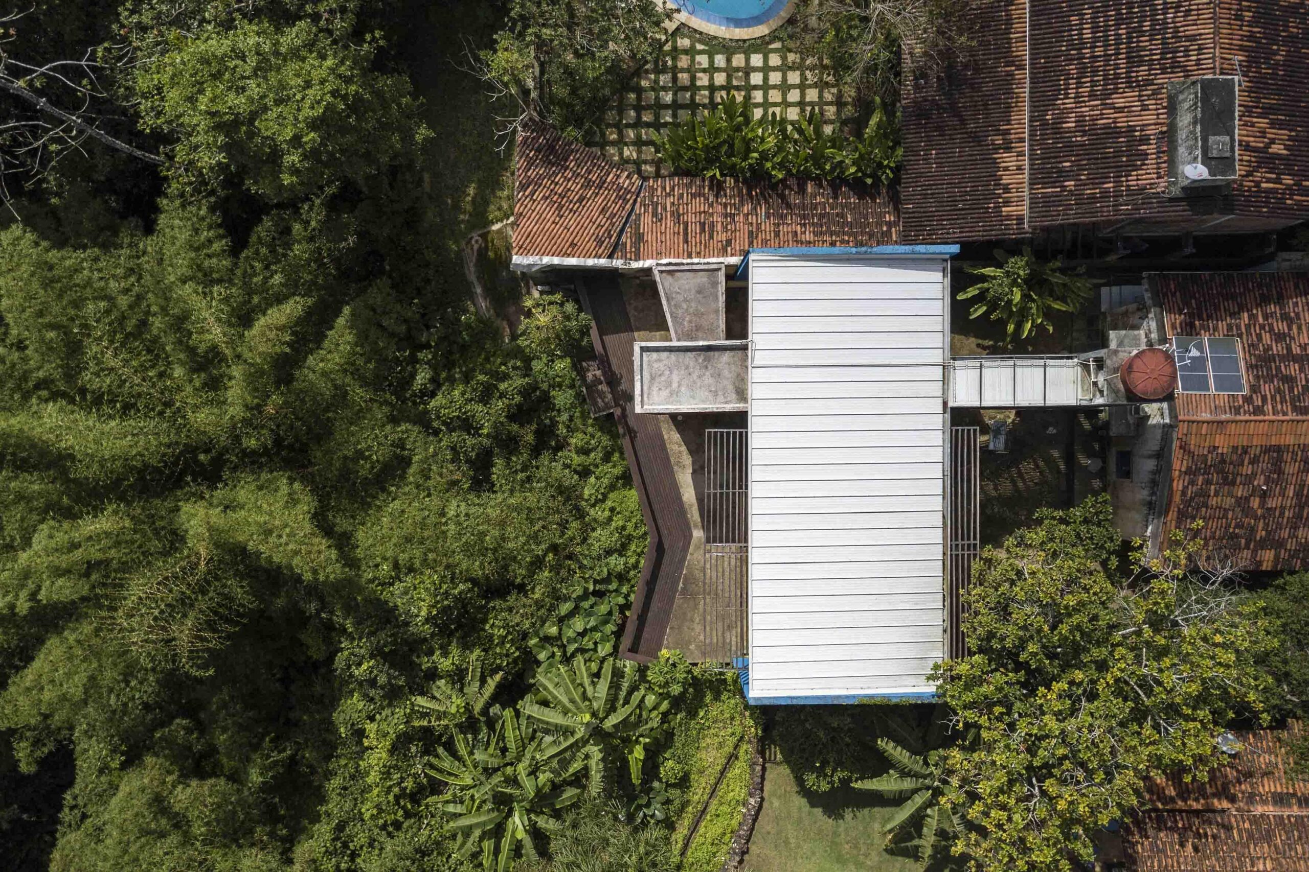
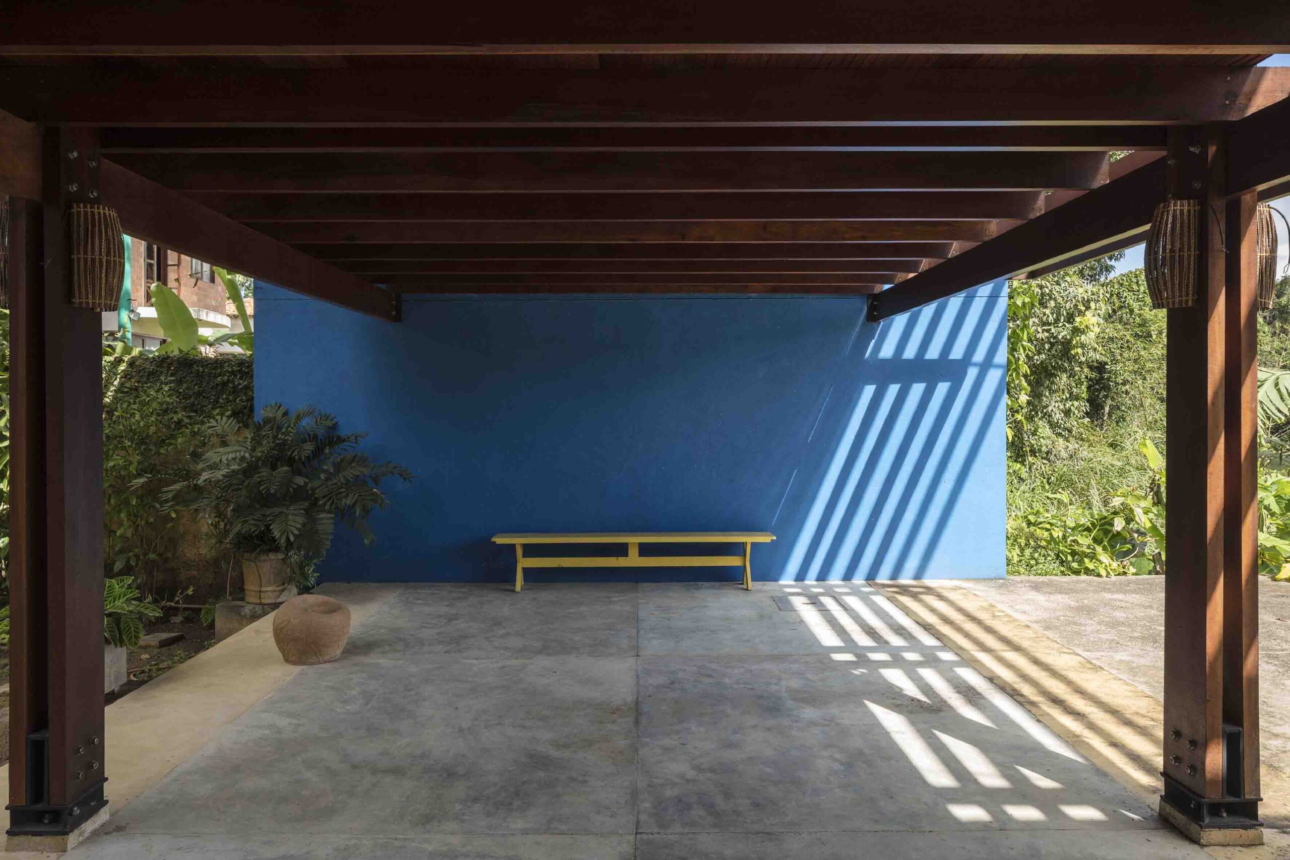
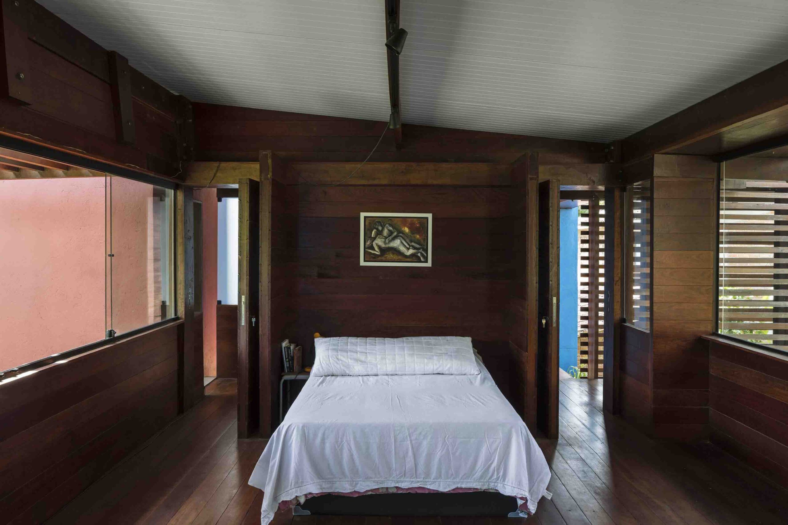
The Residence in Aldeia III is located in Aldeia, Brazil, an area characterized for its green landscape surrounded by the Atlantic Forest. This specific project is an expansion for a couple and their six children. The concept was to provide a smooth continuity of the existing house and integrate with the original circulation, considering residents’ daily activities. The demand for the new building included a multifunctional space that serves as the workplace for birth assistance and a place for family reunions and work meetings while also promoting privacy for the parents.
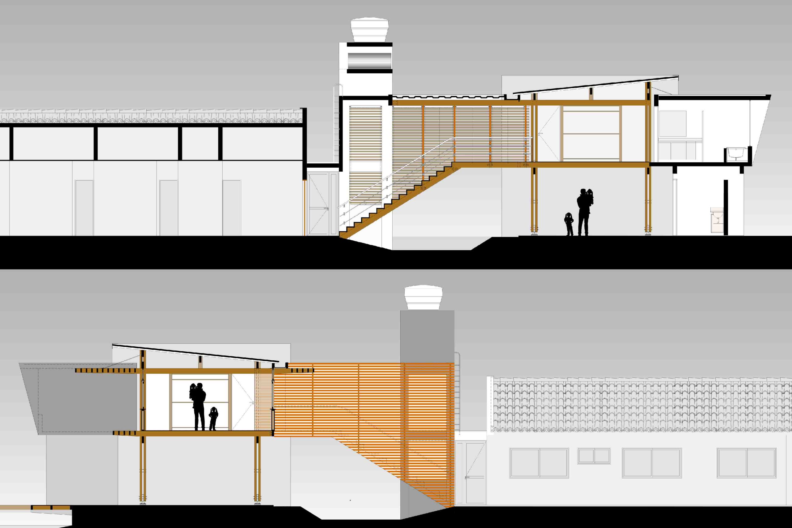
The challenges in meeting the requirements were to fit all in one volume and the site configuration with a steep slope. From this, the architects designed a suspended pavilion and an open space on the ground floor to support the demands without interfering in the dynamics inside the house. The floor plan designed enables different possibilities in terms of spatial configuration for future scenarios, allowing the installation of partitions for the creation of new rooms.
Images courtesy by the architects.
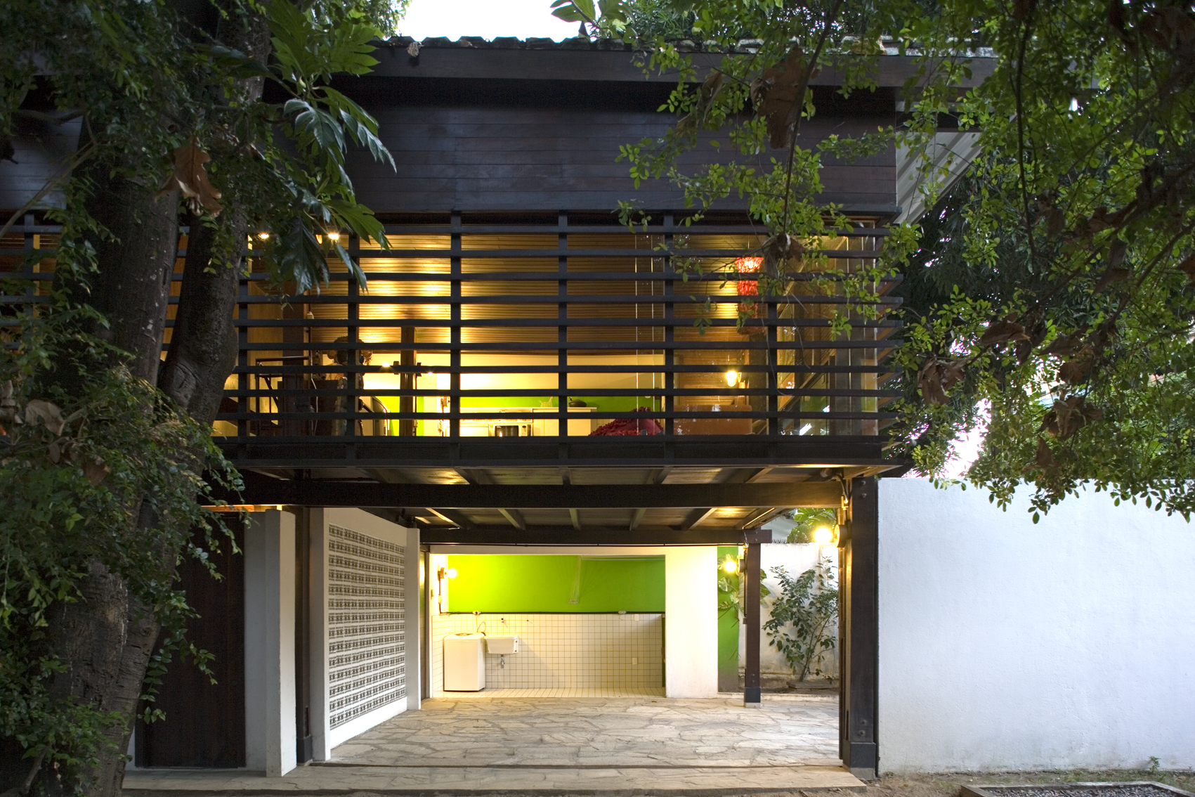
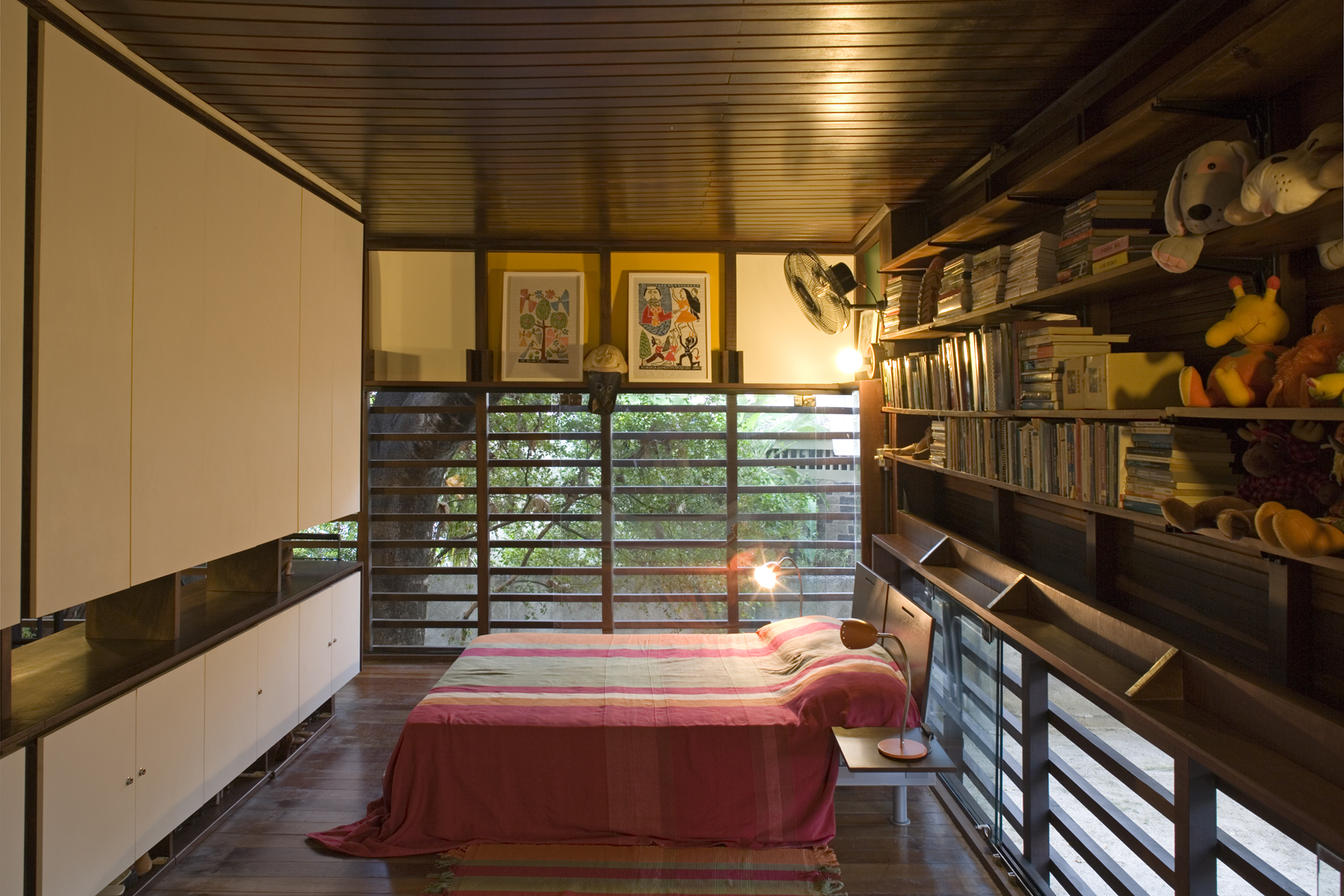
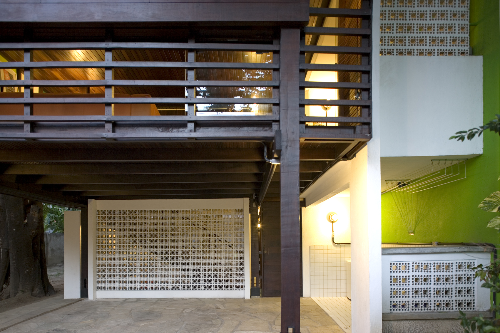
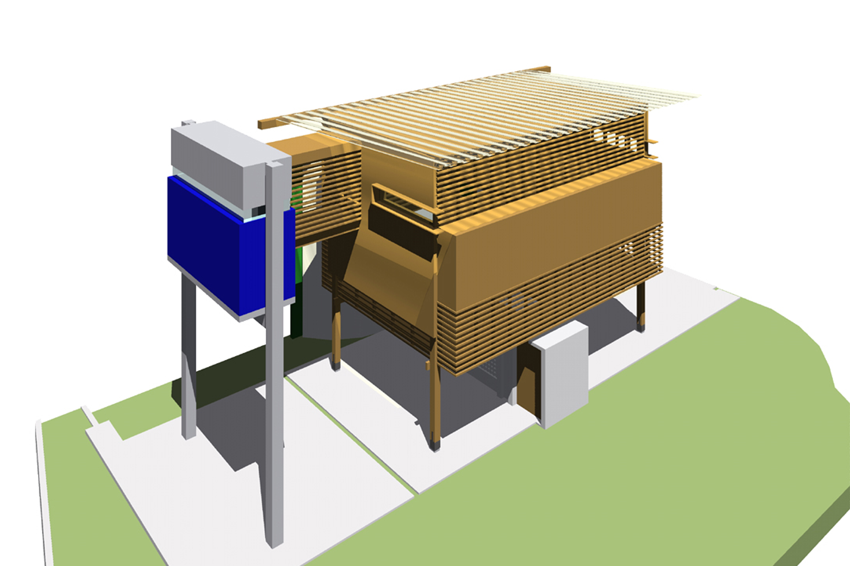
The Residence in Derby is located in Derby neighbourhood, an urban area in the city of Recife/Brazil. The construction was divided into two stages, one completed in 2004 and the other in 2008. The site is a unique space, characterized by the architects as an urban oasis: an area with a high presence of trees and nature around, that once was farmland inside a massive constructed environment. Due to this peculiarity, the site has a value that attracts building contractors. This led the architects to conceive a design that would minimize the interference on the land and preserve native trees.
Thinking about a future scenario, the architects decided to design a house that could be easily relocated if someday the owner received an offer to sell the site. Therefore, it would be a one time expense by designing for future disassembly.
Images courtesy by the architects.
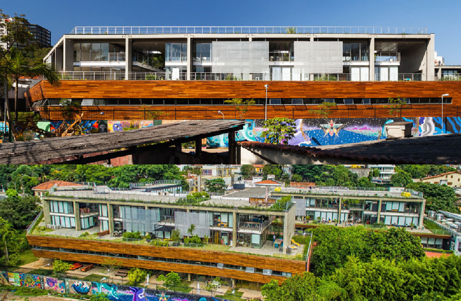
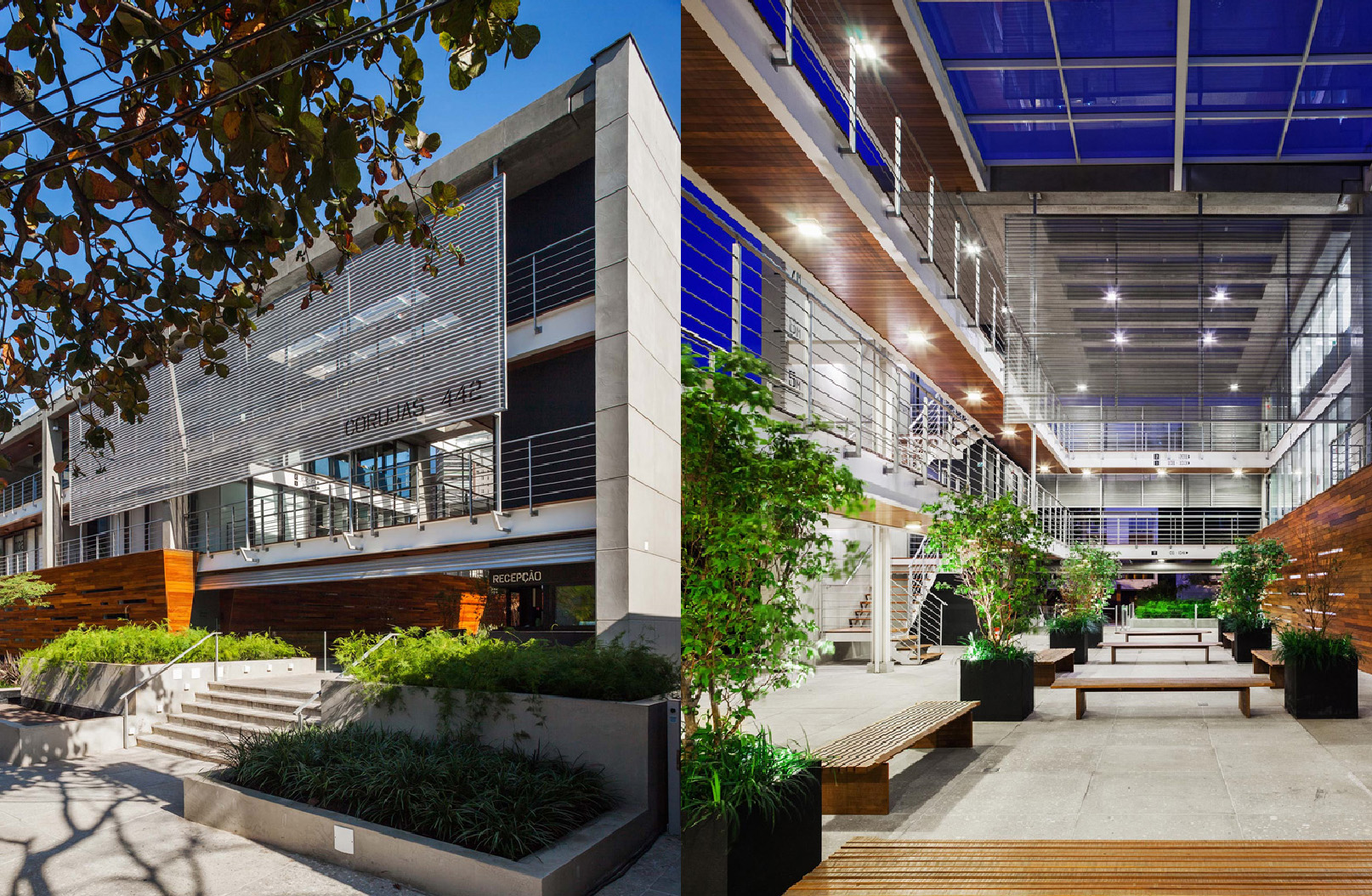
The Corujas building is a corporate project located in Sao Paulo, in the small neighbourhood of Vila Madalena, a place composed of low-rise buildings and known as a cultural and bohemian neighbourhood. The connection with the neighbourhood was a relevant aspect of the project briefing, therefore, the building has a setback where a small square is located and functions as a public space for the community.
The architect’s mindset about the end users’ experiences was crucial for the conception of a unique space, with private gardens and areas for social interaction, different from the corporate building pattern of the city. It is distinguished by the contrast between the massive wood basement made of timber reforestation, and the upper floors made of bare concrete and glass panels that enable the users to have different views of the neighbourhood providing spatial quality and good daylighting. After the project completion, the offices were delivered without furniture allowing the user to customize the spaces.
Images by Rafaela Netto, courtesy by the architects.
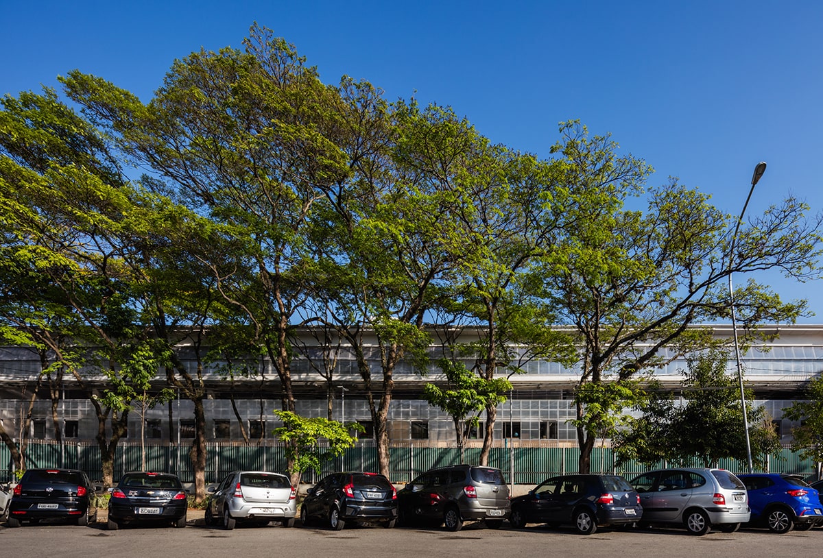
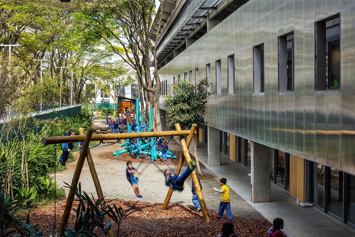
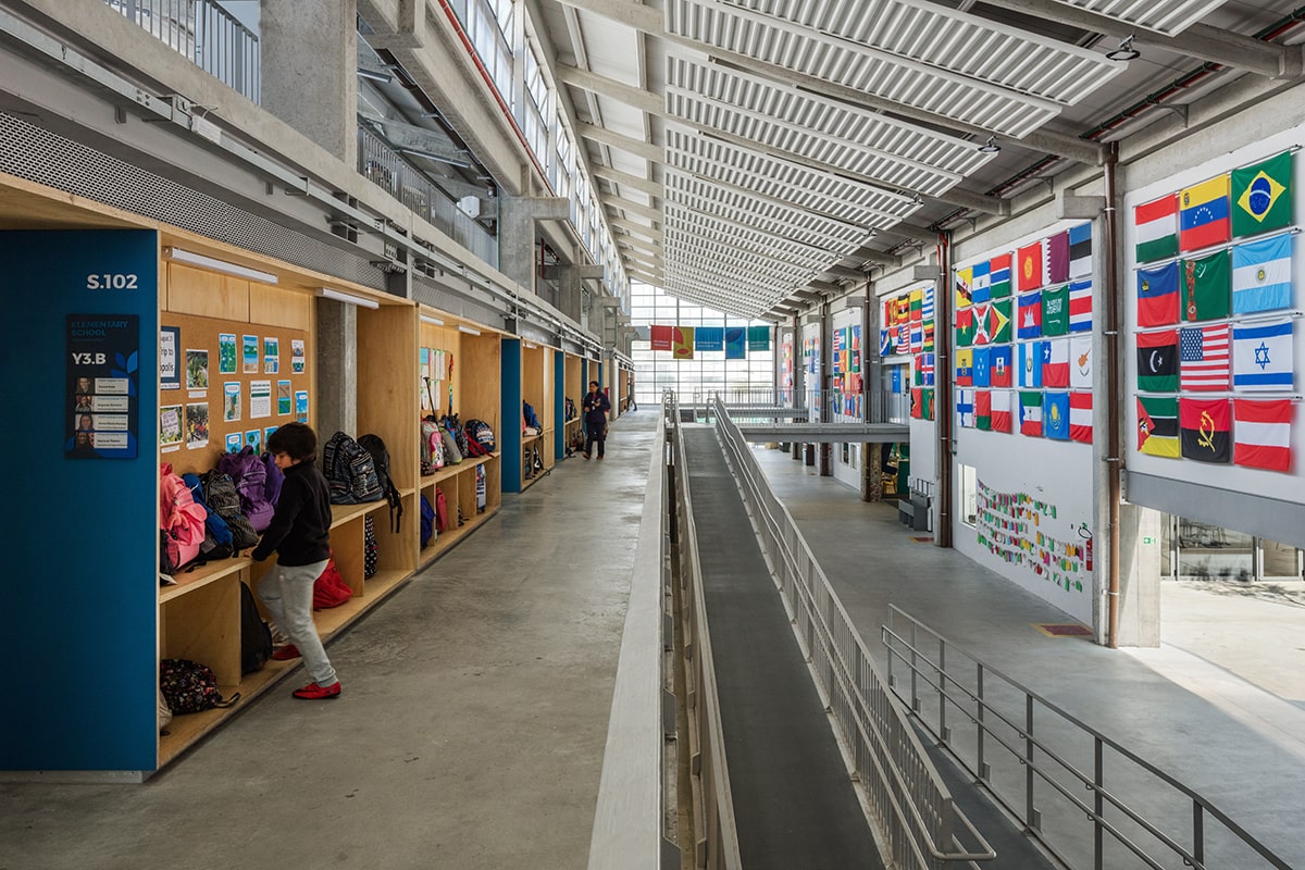
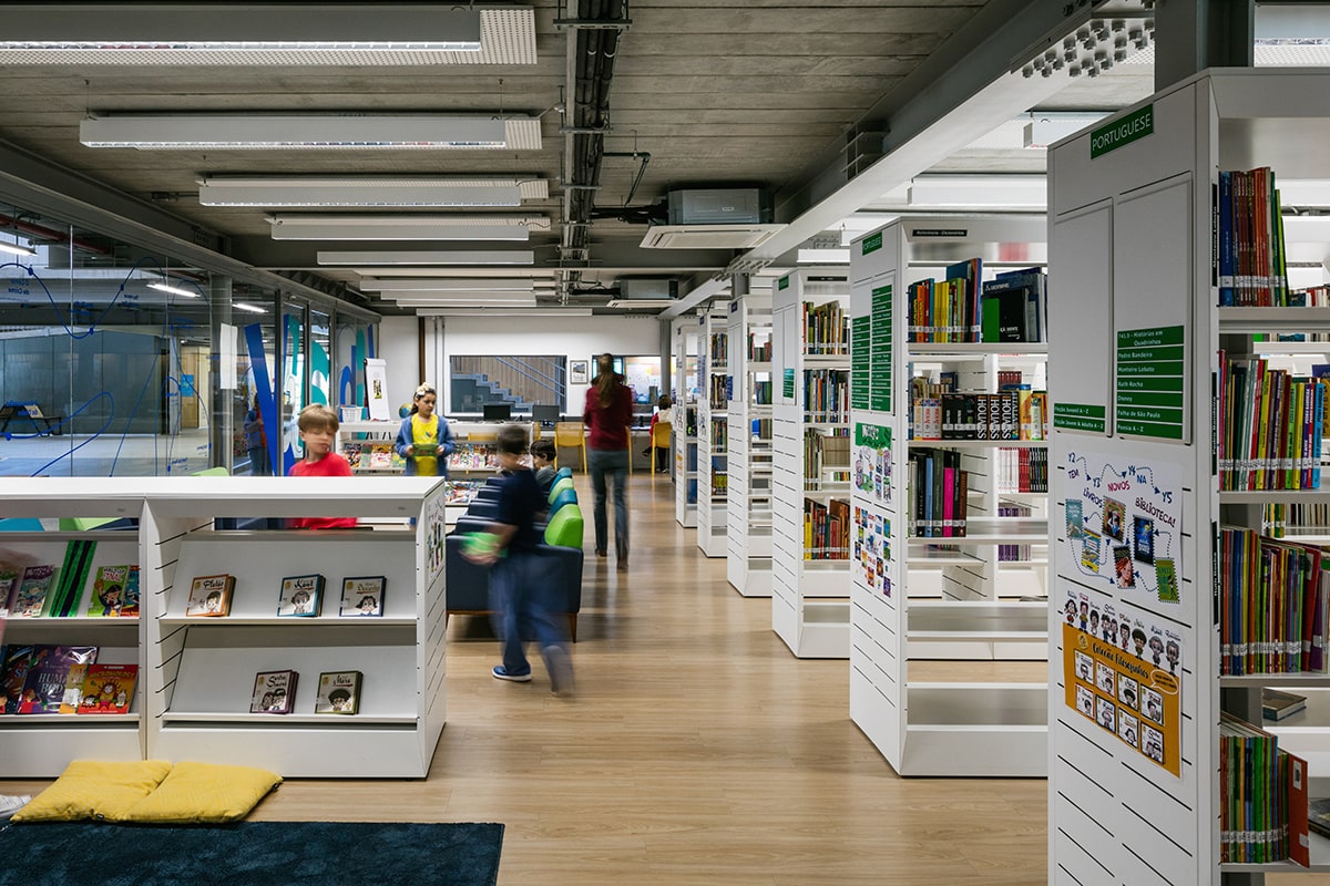
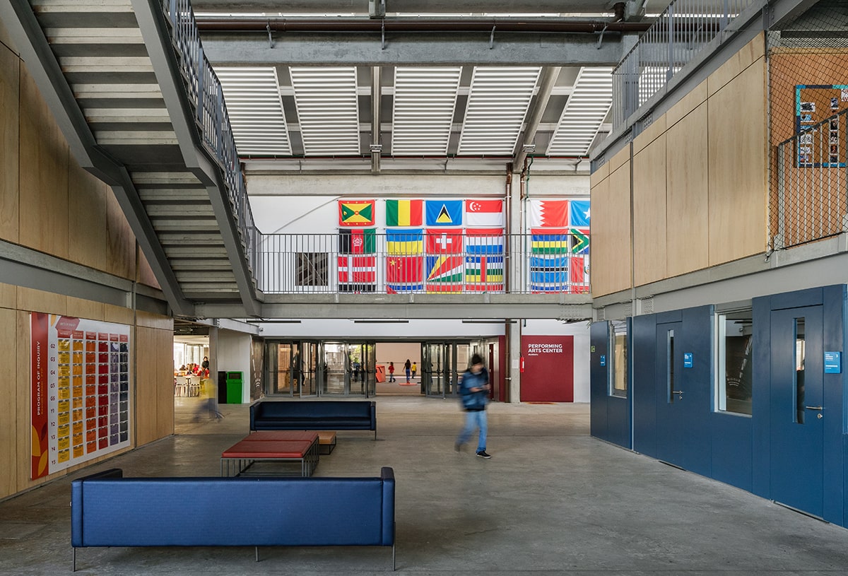
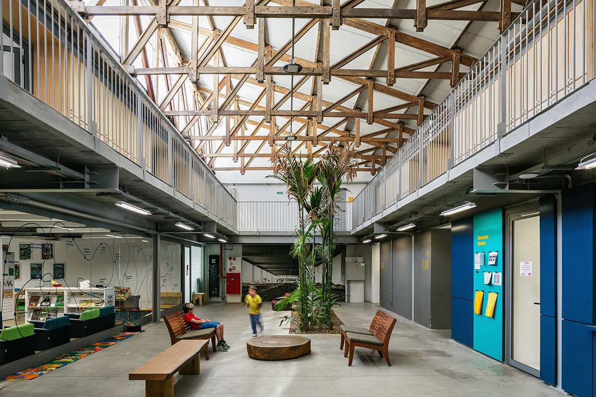
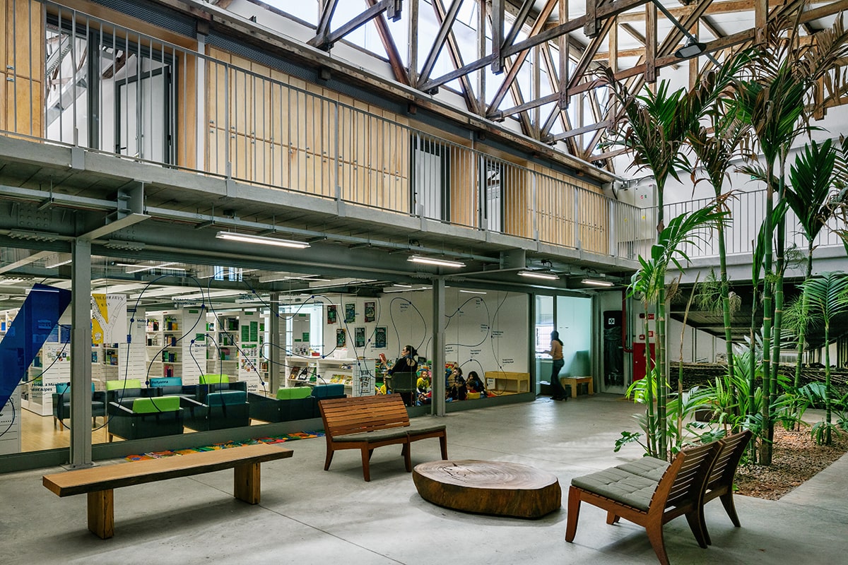
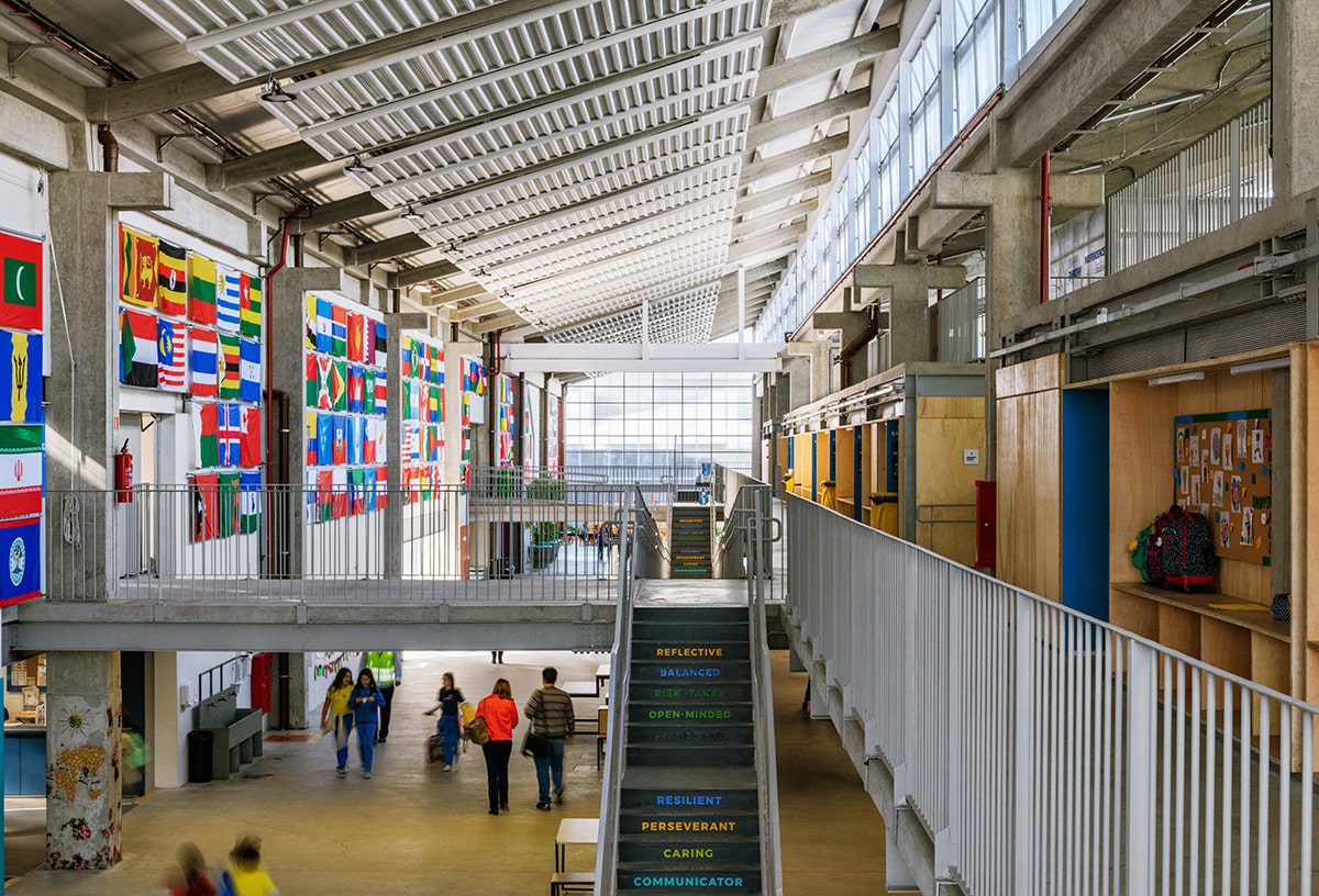
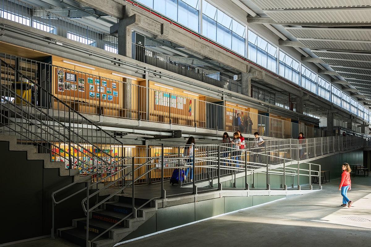
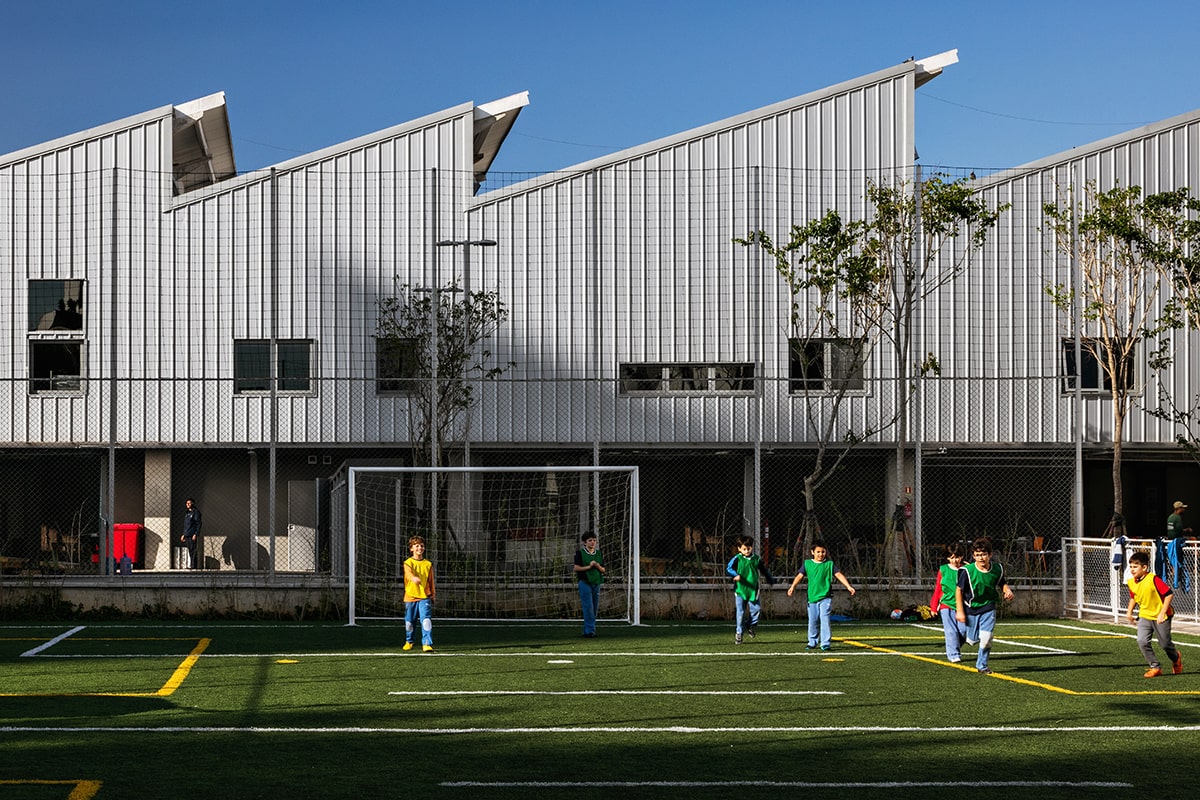
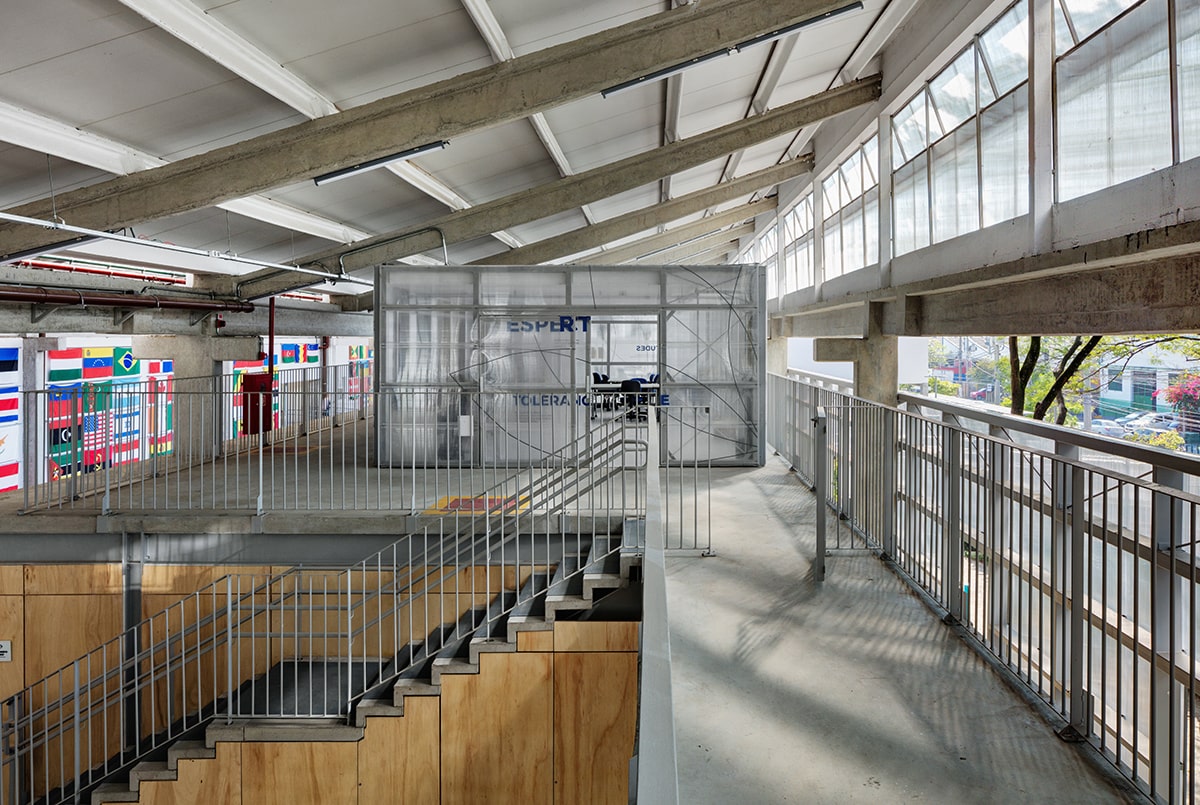
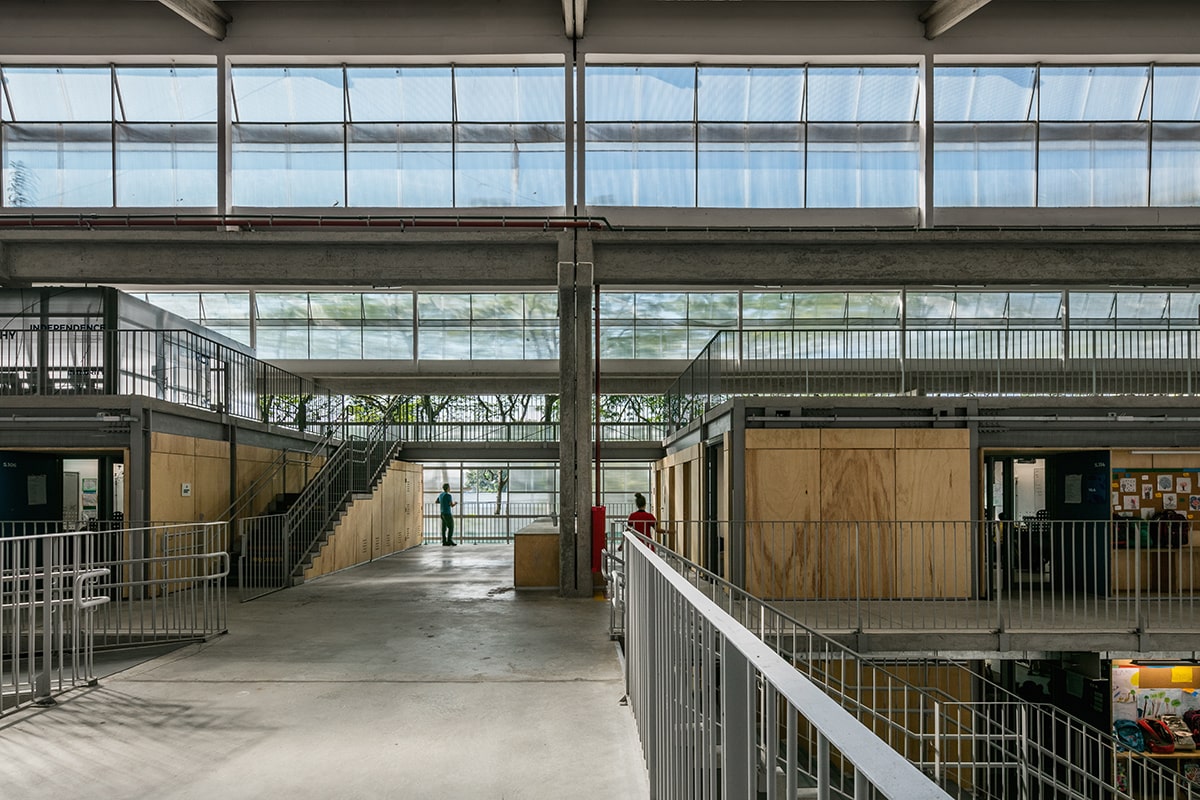
The Beacon School was designed for over 1,000 students and it is located in Sao Paulo, Brazil, The project was completed in 2018 after a competition won by Andrade & Morettin Architects + GOAA. Contextually, the school acted as a catalyst for the redevelopment of its neighborhood, an old industrial zone, characteristic of the city of Sao Paulo, that has warehouses as its main built heritage.
Zooming out one can see that the school’s adjacent neighbours are two favela communities (Favela do Nove and Favela da Linha). This is a very unique context for a school that is for elite children and where 70% of the properties were without activity – although the creative industry has begun to settle in some of the other warehouses which creates a great synergy with the school. The narrative originated in a universe of preserving the built heritage as much as possible: the maintenance of the industrial shed typology,, its image and history was the architect’s main parti. The adaptive reuse of the warehouse, by taking advantage of the existing structure is also the main sustainable aspect of this project and they used this idea as a key guiding principle to prevent any unnecessary demolition.
Images by Nelson Kon courtesy by the architects.
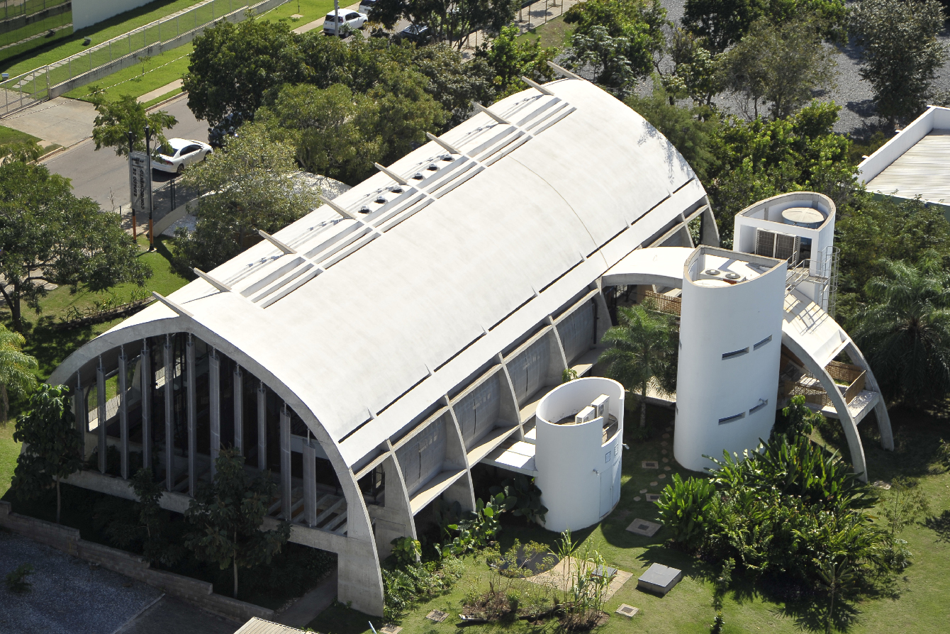
The SEBRAE Sustainability Center (CSS) is located in Cuiabá, midwest region in Brazil and completed in 2010. The building was built at the Political and Administrative Center (CPA) of the State Government, a region mostly constituted of institutional buildings and awarded with excellence in the BREEAM In-Use certification.
The narrative towards the CSS design is also the highlight of the project: it was inspired by the brazilian indigenous hut shape which conferred an unique image and spatial quality to the building according to its surroundings. It was based by sensitive studies made by the architect, since his master including his doctorate, which originated a book entitled ‘Indigenous technology in Mato Grosso: Housing’.
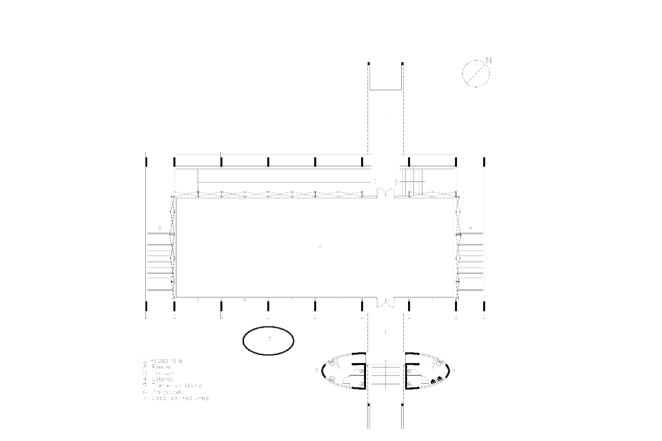
The architect incorporated what he named ‘indigenous technology’. His studies and visits to indigenous villages allowed his distinctive observations of the habitants’ vernacular techniques. The habitations are configured in a simple form and a simple plan with a generosity of amplitude, an open space, with no furniture and no internal walls. The open space strategy was implemented as the main building characteristic in adaptability to incorporate the client demands seeking to receive small and micro-entrepreneurs.
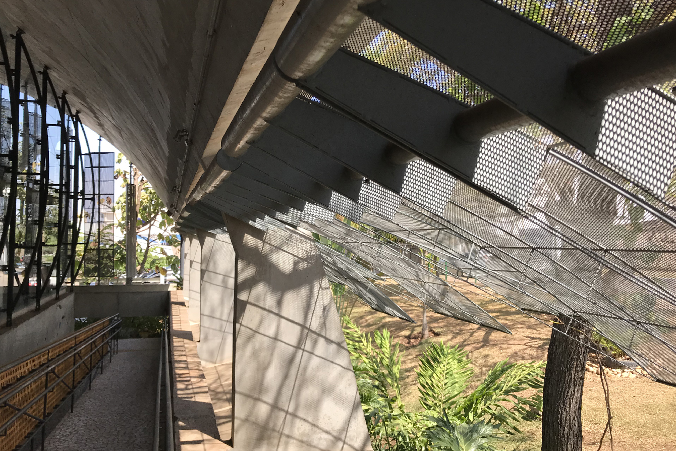
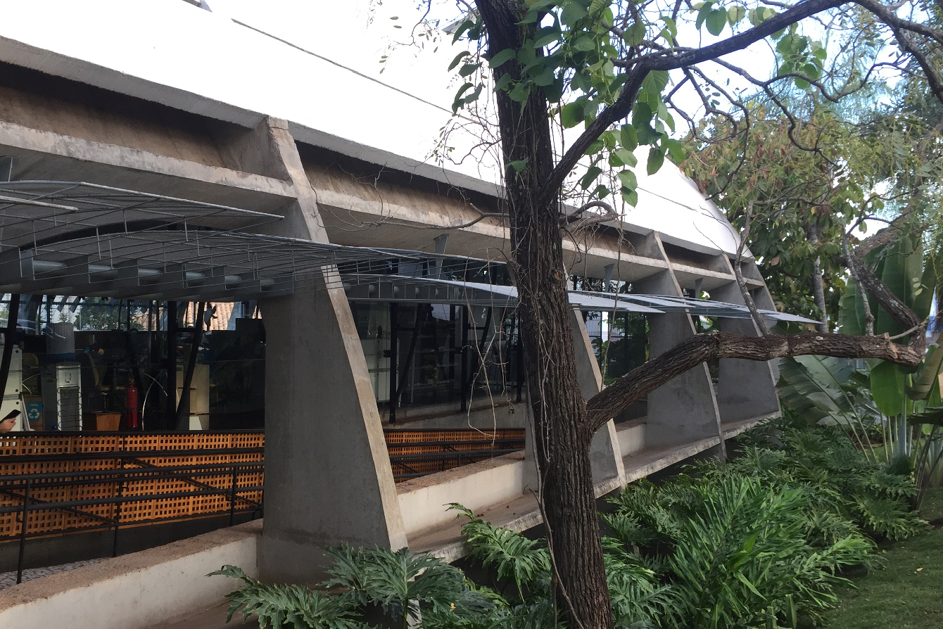
As a sustainable center, sustainability was one of the main concerns on the design and construction of the CSS starting with the building orientation. Sustainable solutions included climate control and energy efficiency. It was also a challenge as the design of the new building should incorporate a technique to translate the layered-straw coverage of the indigenous residences into a concrete structure. It resulted in a two roof shells separated 40 centimeters in which the air circulates, also ensuring the reduction of internal temperature as the lower shell is always cooler, and where the pluvial water is collected too. Besides that, the existence of brise-soleils marks the CSS façade,which can be handedly changed to control illumination and ventilation and permits a distinct experience between the interior and exterior, where almost all of the original vegetation was maintained.
Images courtesy by the architect and Carlos Blau.
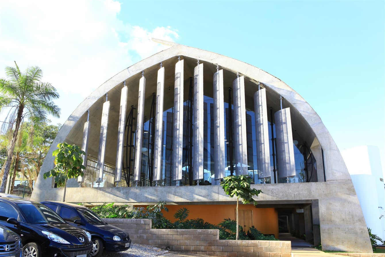
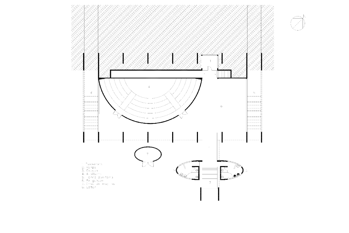
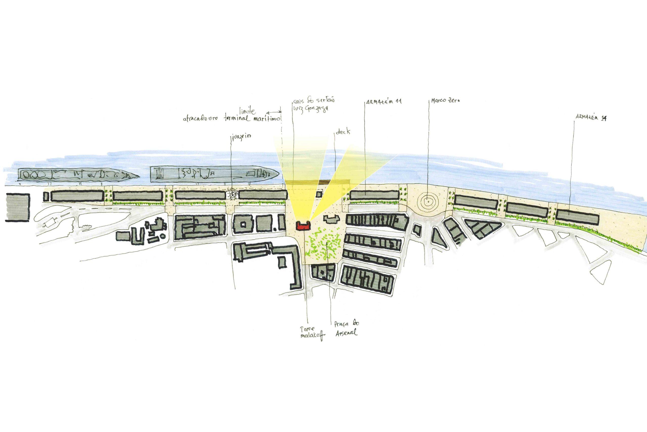
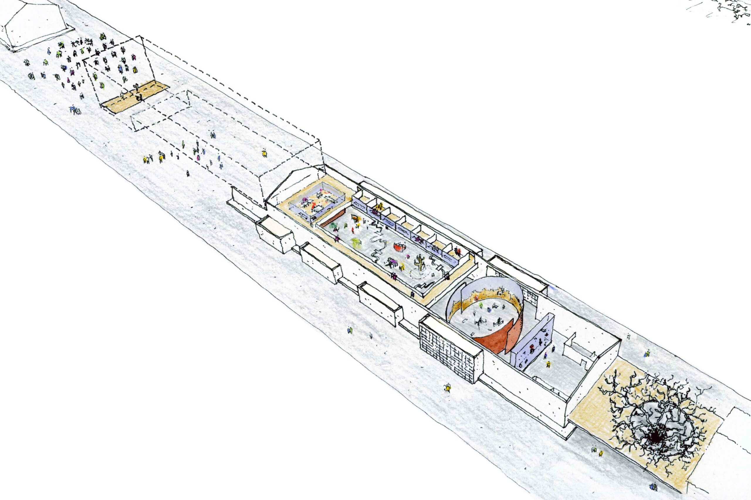
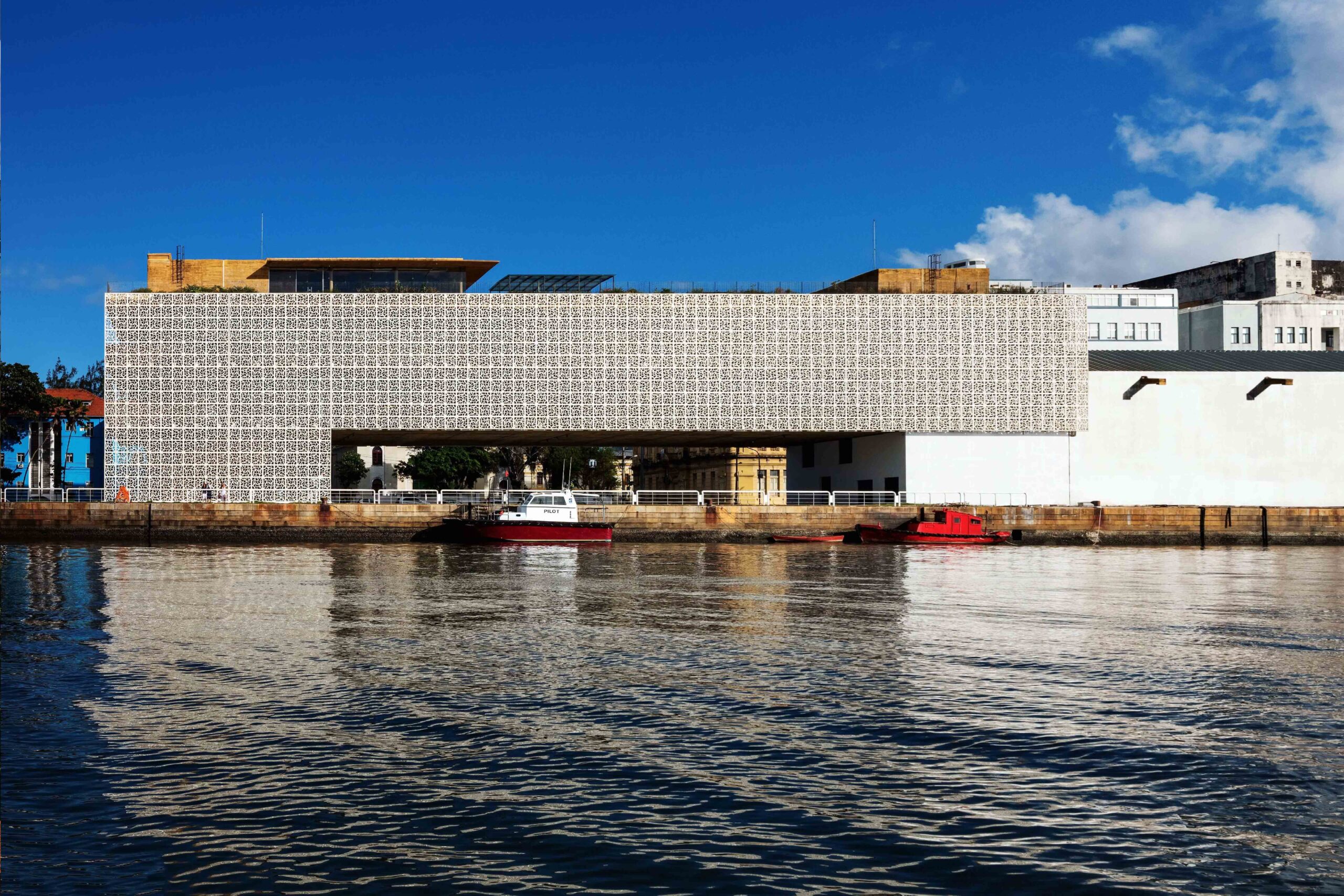
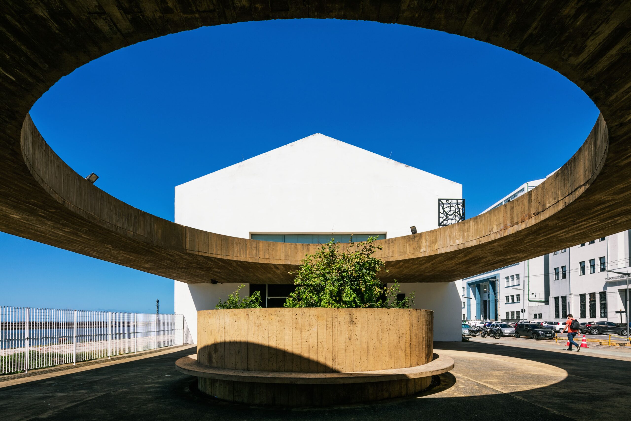
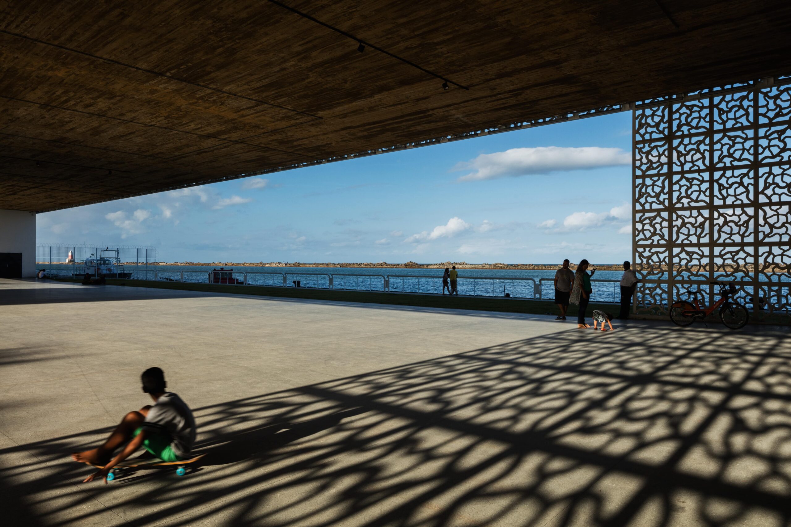
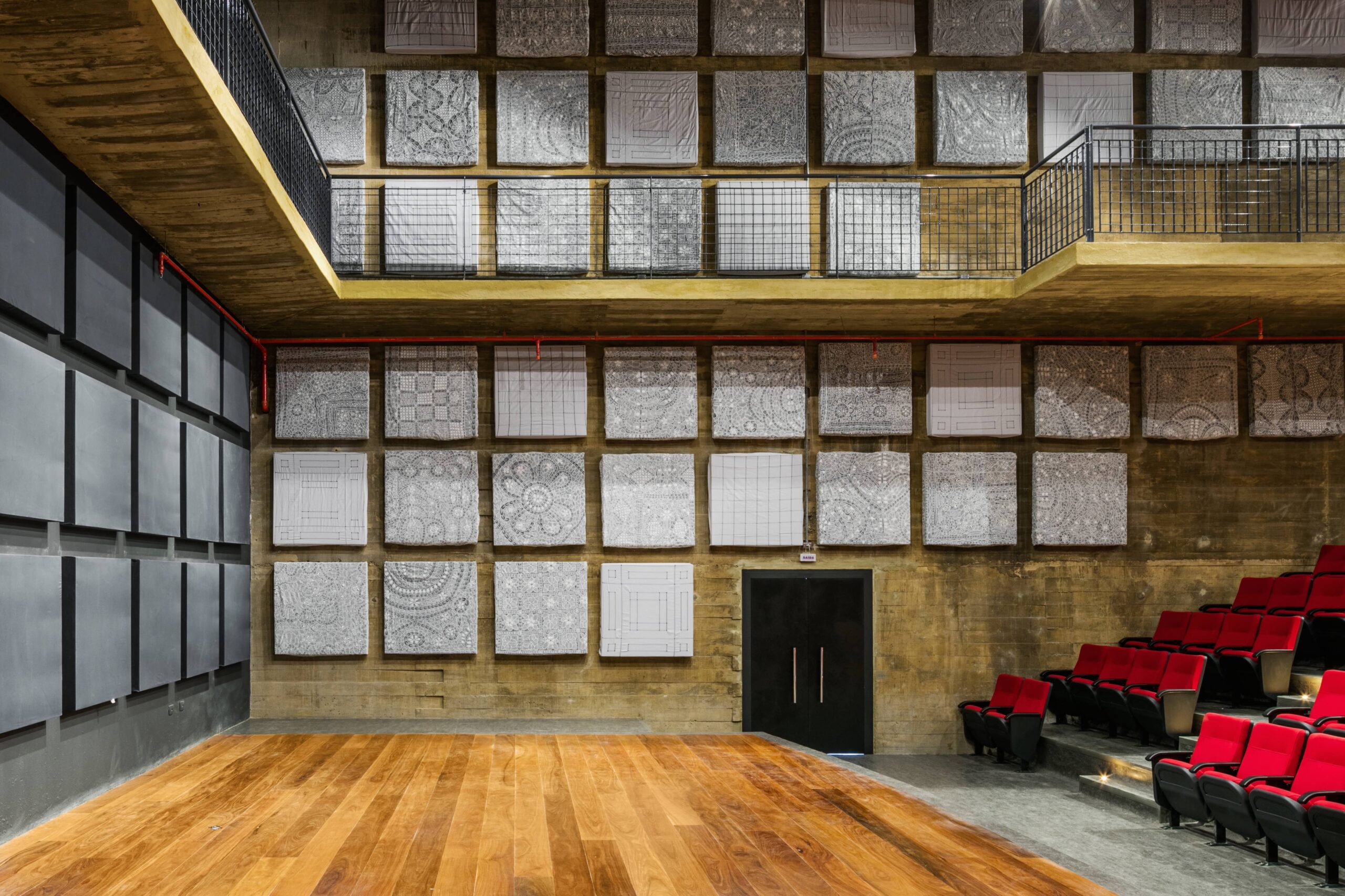
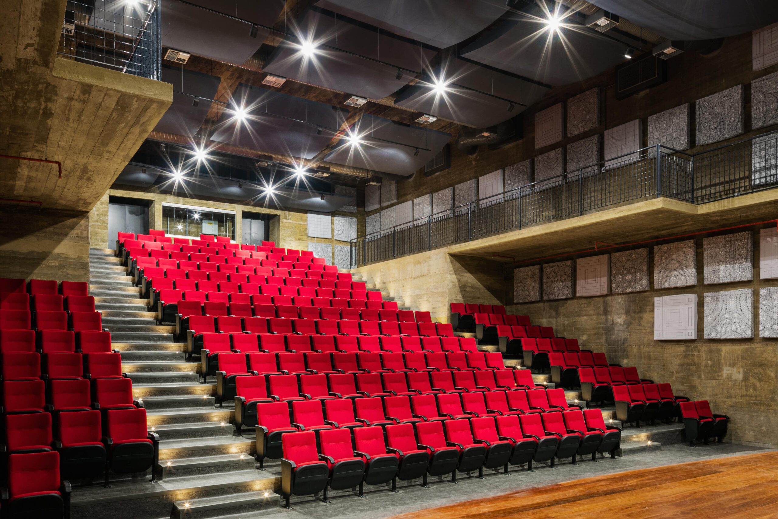
The Cais do Sertão Museum (CSM), a building located in a historical neighborhood of Recife. The narrative of the project was creating an experience of the northeast Brazilian outback (the Sertão) inside the space of the building. As a multimedia museum, with few objects, but a lot of films, games and electronics plus exhibitions, the building was designed with an open plan and oversize spacecharacterized by a high ceiling height along with large spaces with undisturbed obstacles. The architects also designed more than two thousand white cobogós – a typical element of the Modern Architecture in Recife to filter the light inspired in the dry twigs of the outback region to minimize direct solar insolation configuring the passive climate control characteristic.
Images by Nelson Kon courtesy of the architects.
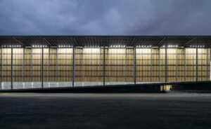
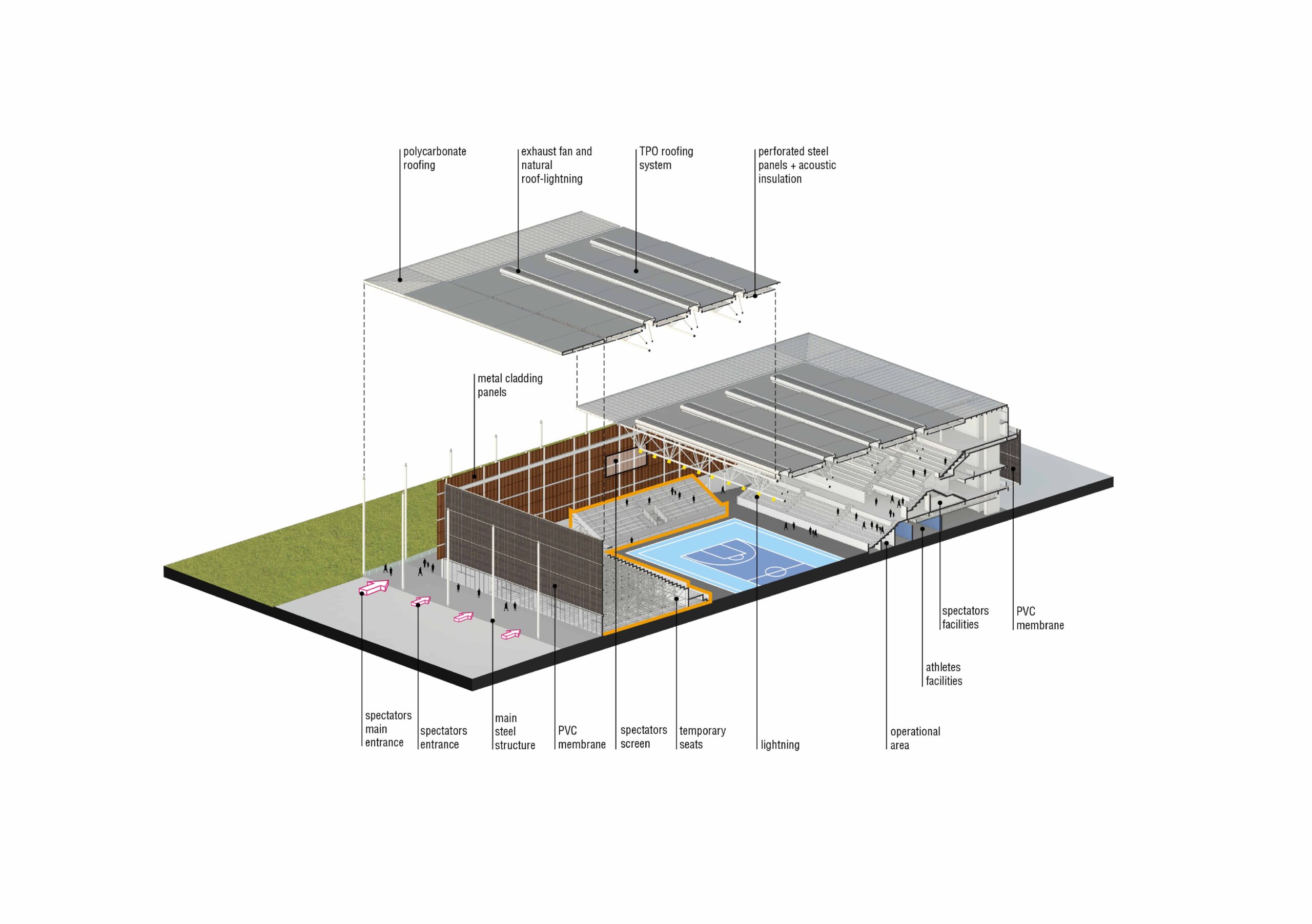
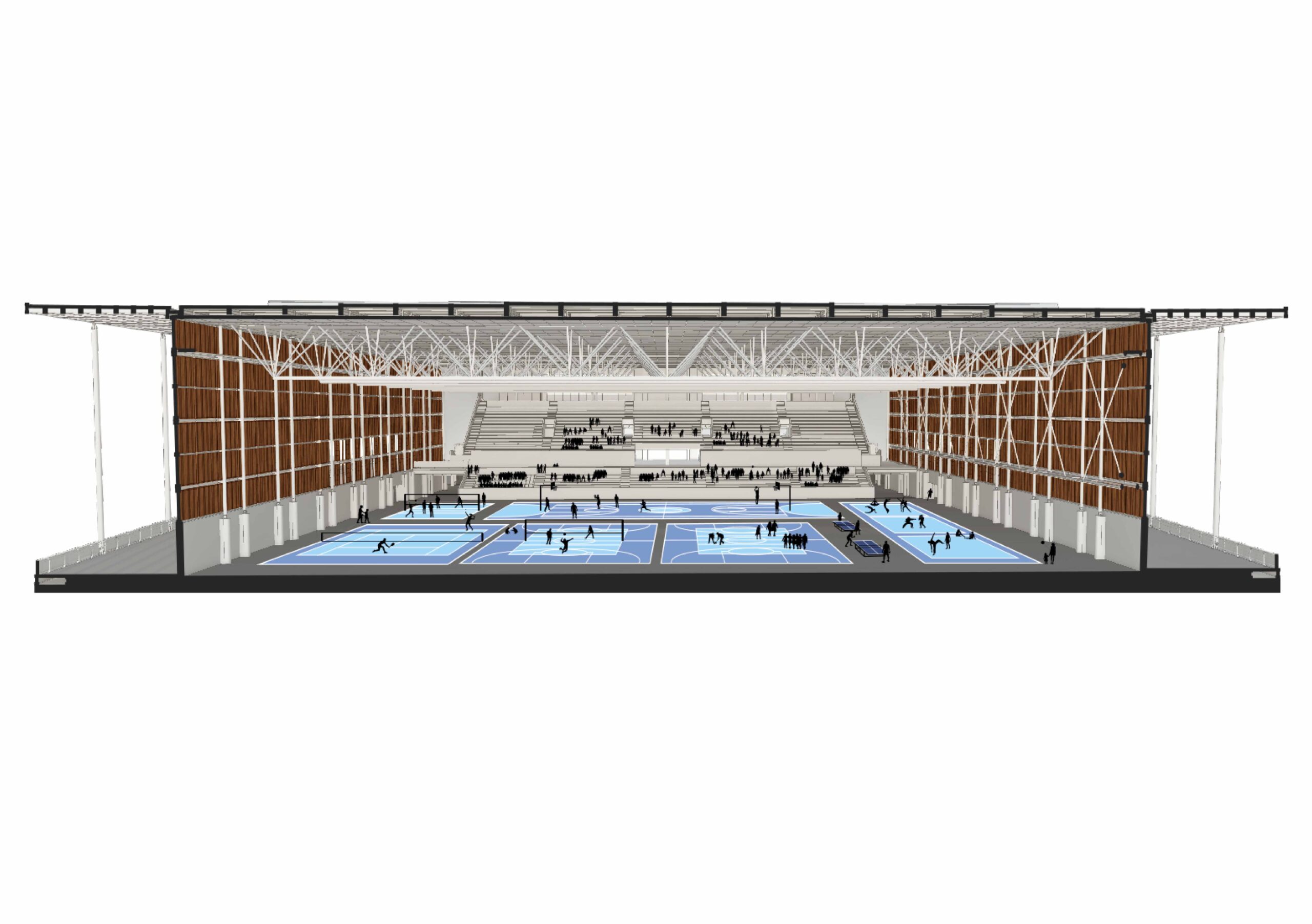
The Youth Arena is a sports facility built for the Olympics in 2016, in Rio de Janeiro. It was constructed to host specific sports modalities as women’s basketball, fencing pentathlon, and Paralympic fencing, during the event, and to adapt for the post-Olympic occupancies, as a training area for different activities and possible events involving the community.
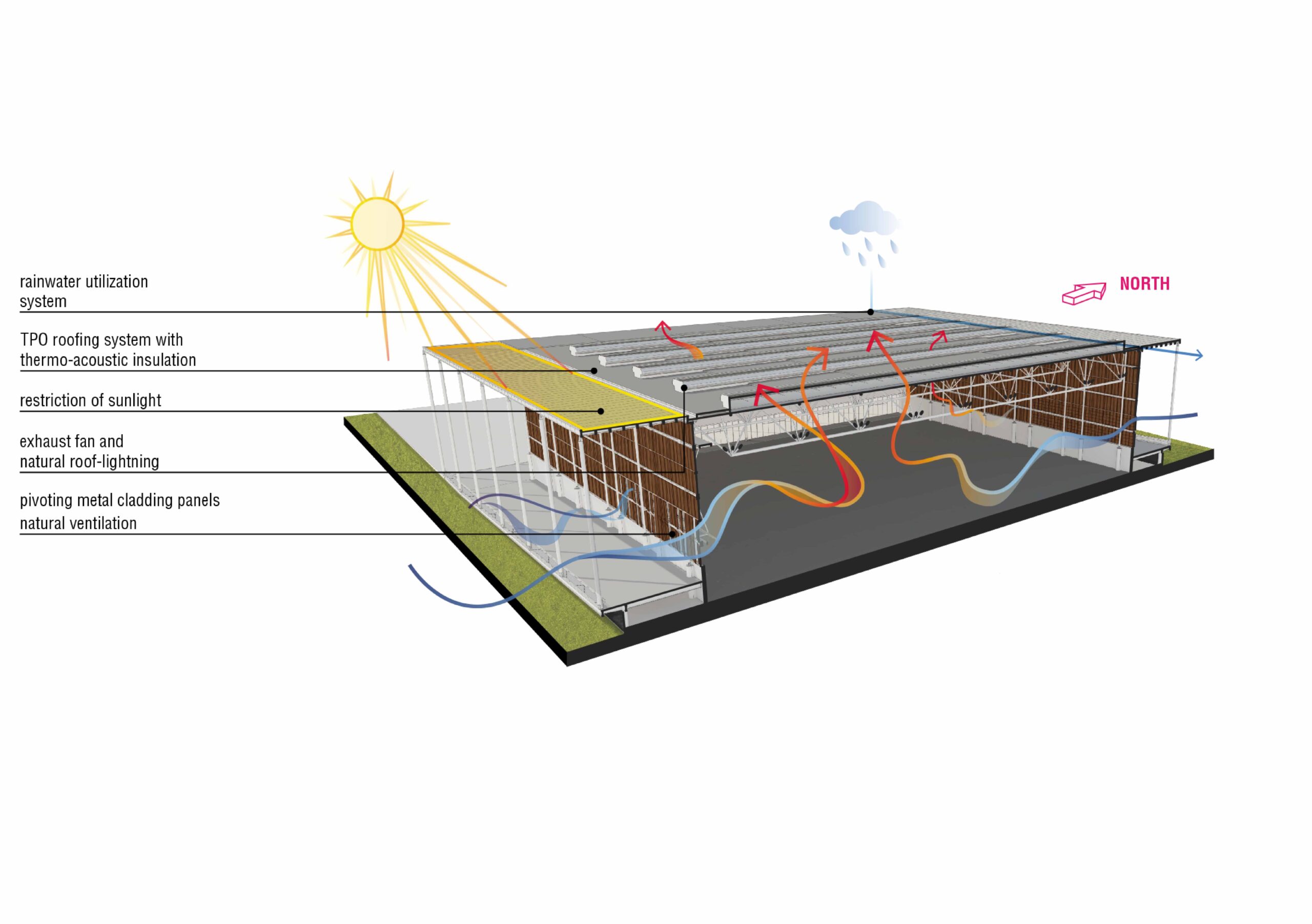
The project has two different stages: one planned for the event, and another for the use after the Olympics as a legacy for the city in a broader spectrum considering future uses. One of the strategies was maximizing the building use, locating temporary spaces on the outside which were only necessary during the event. The creation of these dismantlable tents aimed to reduce the constructed area of the Arena, consequently diminishing the building size according to the intended legacy. These strategies designed to achieve a level of adaptability also contributed to the project’s sustainability.
Image by Leonardo Finotti courtesy by the architects. Diagrams by the architects.
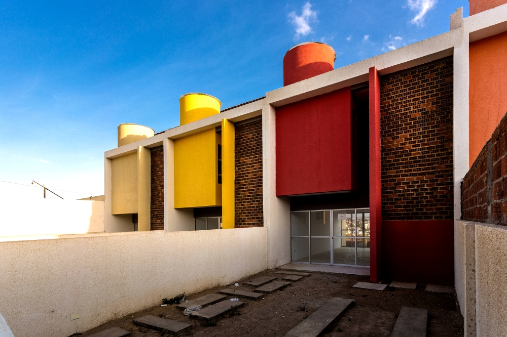
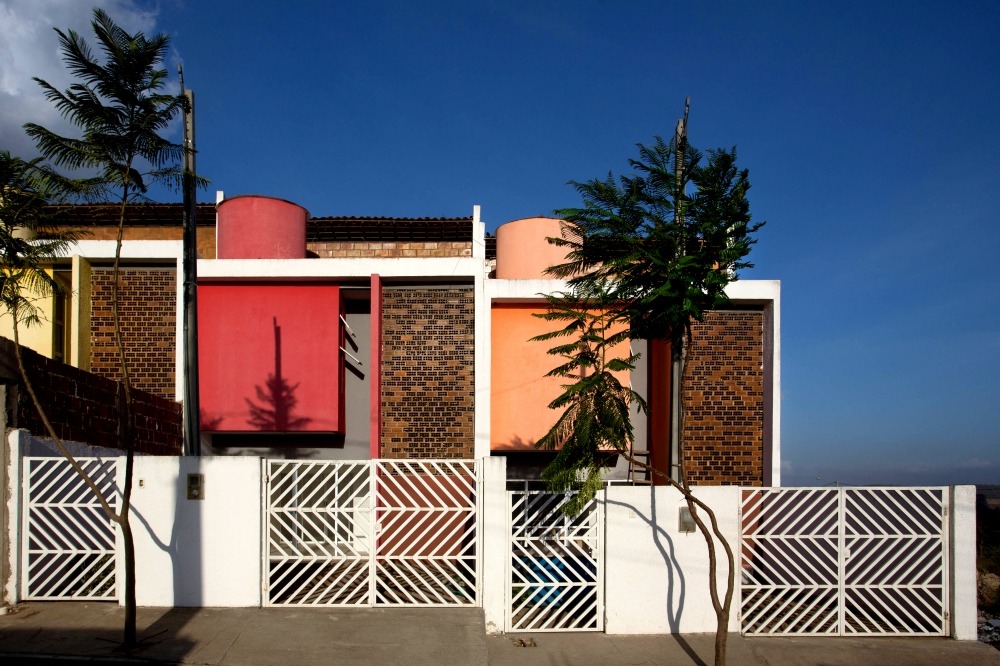
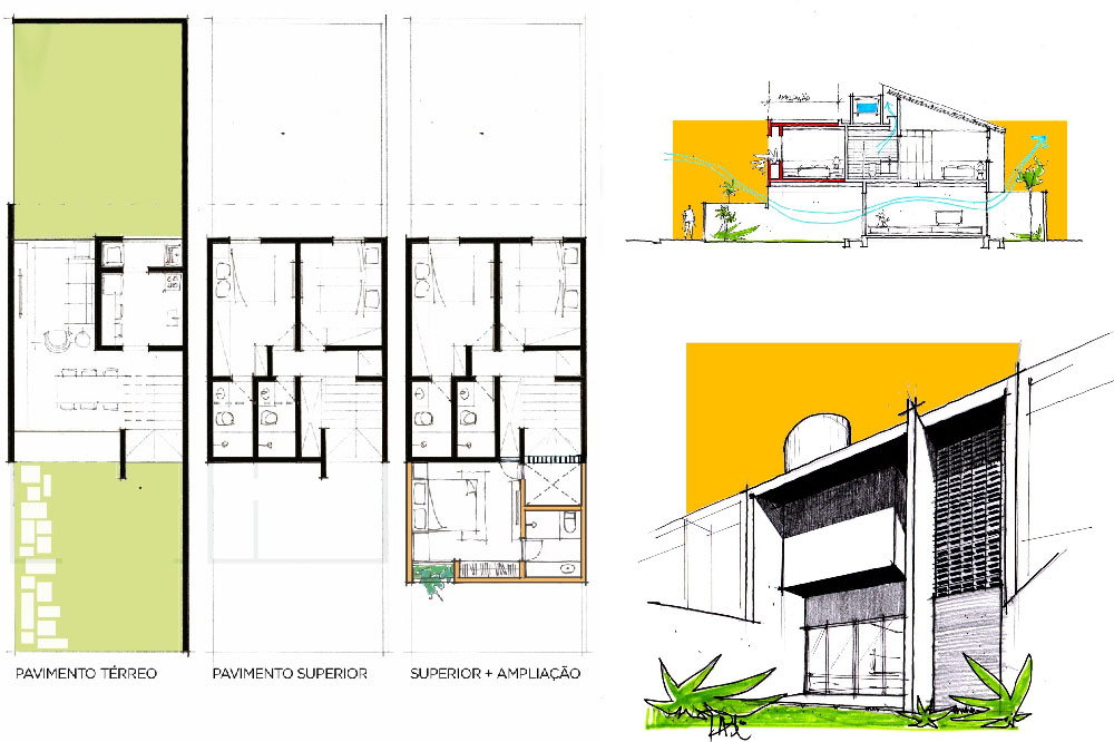
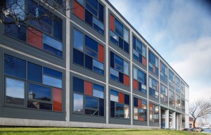
The Sobrados Novo Jardim (SNJ) building is located in Caruaru, a city in the Northeast of Brazil, in the State of Pernambuco, completed in 2016. One of majors characteristics of the SNJ is the building image, by use of vibrant colors on the facade and the detail of the curved water reservatory that break with the idea of the absence of identity in homes for the low-income people. The architects were mainly concerned with allowing extensions as a consequence of their past experiences and feedbacks by the end users.
Because the building is located in the Northeast of Brazil, some solutions were strategically created to guarantee adequation to the climate. The façades incorporate a typical element of the Modern Architecture in Pernambuco: the cobogó which is a hollow element that allows constant air circulation, creates an unusual play of light and shadow and a visual linkage. The cobogó was made using the 8-hole brick itself, lying horizontally, allowing that even when the frames are closed, the ventilation continues to cross.
Images by Antonio Preggo courtesy by the architects
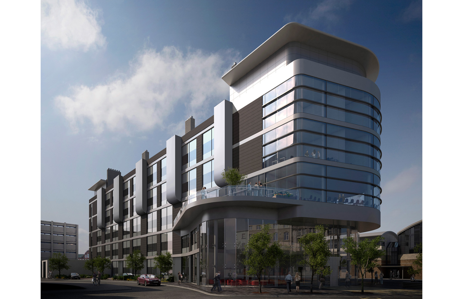
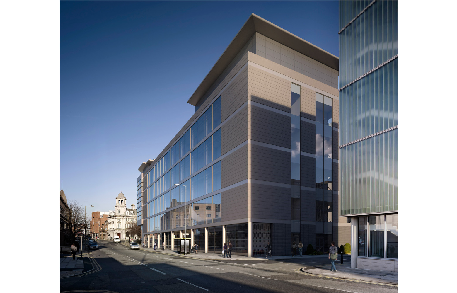
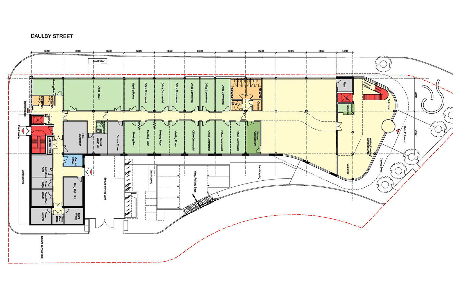
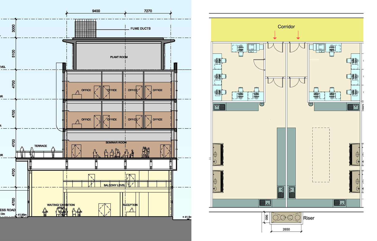
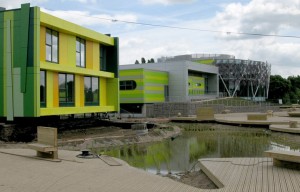
The Bio Innovation Centre will be a state-of-the-art lab facility and the first on site for the proposed large-scale ‘Bio-campus’ – setting the stage for Liverpool to be recognised as a leading international centre for Life Sciences. The contemporary architectural language of the building’s exterior does not communicate a specific use typology and is comprised of lettable office space primarily on the ground floor with two floors of chemistry and two floors of biology labs above. The five-storey building uses a standard 6.6m grid, which is divisible to the 3.3m window module and allows for the lab spaces to be subdivided into smaller spaces if desired. Structural, service and welfare cores on both ends, non-load bearing partitions and a generous 4.6m floor to floor height allow the floor plates to be subdivided in a variety of ways and afford to accommodate most commercial uses within the centrally located building. In addition, the single storey section has a foundation to withstand being increased to the full 5 storey building height and has been designed to consider future connections as the bio-campus develops.
The labs themselves are of a standard size and proportioned to facilitate a range of lab bench layouts. The labs offer a rational layout of service drops and runs to maximise versatility and are designed so that internal modifications to lab layouts does not affect the servicing strategy of the building. The ratio between lab and admin space can be easily altered based on the user needs and are suitable to be converted into office space. The building potentially offers flexible leases as well which would allow occupation of labs to be as short as a month. The labs are supported with shared storage and meeting spaces. Meeting rooms and the office module are kept constant so that uses can be interchangeable and meeting rooms have demountable folding screens in between so sizes can be varied. In addition to the lab and office spaces the building incorporates a seminar space and terrace which allows the building to cater to an array of social events. The building’s versatility is also enhanced with its undefined large open plan area on the ground floor which has the potential to exhibit work and engage the public in a variety of ways.
Images courtesy of Nightingale Associates
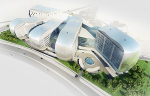
The iconic new medical complex for KPJ, the largest healthcare provider in Malaysia, aims to provide a mixed use facility that will cater to all the needs of a growing international medical market in Malaysia. The design consists of several wings or centres of excellence which will host different medical services (e.g. oncology, cardiology). While located on a compact site just off the motorway linking Kuala Lumpur and Singapore, the design incorporates several tactics to allow the building to expand overtime. Approximately 70% of phase I will be fitted out to suit the current needs allowing the remaining floors to be fitted out as needed. In addition, the design allows for two additional wings (fingers) to be constructed at a later date and integrated easily into the ‘healing hand’ concept. Additional growth capacity is also incorporated into the design of the multi-storey car park which could be converted into accommodations with its matching floor to floor height. While the wings are not identical in spatial configuration, they remain similar enough (plant room location, cores and vertical circulation) to satisfy the needs of different medical practices and include the provision of ‘soft’ spaces to allow organisations to grow internally as well.
Rationalised room sizes, standardised grid layout and modular façade design all aid in the legibility of the design and its capacity to adapt to changing needs. The double skin consists of a changeable curtain wall system with a mesh screen positioned a metre away to allow for maintenance of the inner façade and hide the air con units of the offices as well. Windows are designed in strips which can be changed easily (size, material) to reflect changes in the use and room configurations behind them. Services are separated by each wing allowing for smaller units and ducts to be implemented while the air conditioning system is localised on each floor so that individual control is maximised for each department.
Images courtesy of Nightingale Associates
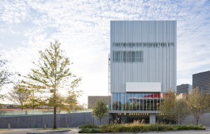
The roots of the Wyley Theatre in Dallas burgeon from the Arts District theatre – a decrepit metal shed that provided theatre companies the freedom to reconfigure its interior anyway they saw fit, thus receiving the name ‘the most flexible theatre in America’. The design of the new theatre wanted to continue the versatility that the makeshift nature of the original theatre offered, but without the repetitive financial costs of reconfiguring its stage. One of the most ‘freeing’ elements of the new design is rethinking the spatial organisation of the theatre by vertically stacking ‘front-of-house’ and ‘back-of-house’ functions rather than placing them adjacent to the theatre on the same horizontal plane. The result affords the chamber to be enclosed by an acoustic glass façade allowing the theatre to open up to the outside plaza space and use the city as a backdrop. The large glass panels contain black-out blinds to create an enclosed box and can be opened or closed to provide an alternative entrance and allow the open space to be extended and used for completely different functions such as large public or private events during the day or other non-performance times.
The 575 seat theatre remains highly versatile adopting the policy of non-precious materials to encourage companies to cut, drill, weld, glue, etc. to the surfaces. The space can transform between an abundance of automated configurations (proscenium, thrust, flat floor, arena) with the help of a small crew in the matter of a few hours. This is achieved by the amalgamation of proven technologies from other uses (e.g. mechanical technologies from those originally developed for moving scoreboards in sporting arenas). The ground plane can change height, tilt, or rotate using stage technology adapted from opera houses, In addition, most of the support spaces are not defined by a single function, many doubling their identities and are cleverly linked to allow for the multiplicity to take form fluidly – from patron’s lounge to a second lobby or the rehearsal room to theatre.
Images courtesy of Rex, Iwan Baan, Tim Hursley and Theatre Projects
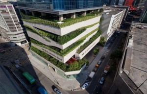
The 28 storey building mixes office space, retail and a ‘green’ car park in an effort to help transform the once heavily industrial area of Kowloon Bay. To enhance its use capacity as the area continues to transform the building is organized as three realms related to the street: public, semi-public and private. The public realm at street level is shared by the office lobby, retail and cafes all adding to the dynamism of the street. In between the car park and the offices above is a podium garden which provides a shared communal space and centre of activity for the building’s users. The private realm elevated above takes advantage of the views and provides an open plan design to respond to the changing socio-economic climate and needs of the neighbourhood. The location of lavatories, access to lifts, MOE provisions, and means of escape were all important parameters in developing a standard ‘office’ floor plate that could easily be divided for multiple tenants. Additional provisions have been put in place to allow the upper floors to be convertible into retail (F&B) with a floor to floor height of 4.3m.
Designed as a bare shell with sufficient floor loading and provisions, the car park floors can accommodate other uses as well. Standard service and cladding components were utilised to allow for easily replacement along with the integration of a gondola system. The building is tightly connected to its surroundings and has the capacity to allow for elevated walkways, creating barrier free access from the metro station and between surrounding buildings. Additionally, the building is setback at its lower levels as not to overwhelm the street and greenery is heavily integrated to ensure a positive contribution to the streetscape.
Images courtesy of Aedas Architects
Conceived initially for Clerkenwell design week, this tiny travelling theatre will reawaken the secretive and intimate performances offered by Thomas Britton’s notorious home concert hall. The theatre will move between locations hosting a variety of events, provoking public engagement by transforming ordinary ‘empty’ spaces into a social place for drinking and chatting on the ‘outside’ and a cozy ‘one-to-one’ space for a variety of theatrical performances on the ‘inside’. The theatre will be pulled by a vehicle between locations remaining ‘theatrical’ in transition with chiming musical bells hidden in the structure of the façade.
Various parts of the façade will transform upon arrival, loosely defining the outdoor social spaces; while a set of steps release to fulfill the curiosity of the wandering spectator, allowing one to explore the inside. The friendly atmosphere of the interior will change depending on the performance as light levels and sound can be reconfigured to suit the performance. Beyond Clerkenwell Design Week it is anticipated for the theatre to find new homes around the country supporting local drama groups.
Images courtesy of Aberrant Architecture
The King’s School Chester is located in the countryside of Cheshire and is a leading independent school in the area. The school approached CGL to review a feasibility study for the refurbishment of the theatre hall. The proposed solution complicated access, ruined spacious qualities of the neighbouring dining hall and was limited to retractable seating. CGL proposed a revised scheme which provided the client with a better quality space with increased versatility for almost half the cost. Fixed support spaces for the hall (e.g. changing rooms, storage) were placed on either end of the open space (26m x 13.5m and 6.7m high) to allow for the remainder of the space to be unfixed with the installation of a retractable seating system, a retractable curtain system, removable staging, adaptable lighting rigs, modular stage units and movable side wings.
The design particularly considered the speed and ease of transforming the space as they wanted to remove any barriers for change (e.g. seats can be fully open or retracted in 10 minutes by a single person). Additional loose chairs are provided for special events and stack on a trolley to be moved and stored easily. Moreover, the architects illustrated to the school that if they increased the level of WC provision as part of the project they would not have to rely on other facilities within the school to meet public licensing requirements which enables the school to hire the theatre for private use and keep the rest of the school closed off – reducing costs and management associated with external hire and increasing its attractiveness. The space has been transformed from a rarely used space to now being widely used for school activities and hired events.
Images courtesy of CGL architects
Located in the outskirts of Yokneam, Israel, the concrete frame and aluminium & glass panel headquarters for CPC serves as an office and production plant for electronic circuits. The building is shaped by formal and informal spaces allowing for a variety of activities to take place. Its cube form is shaped by two wings connected by a service core forming a U shape which is filled by an atrium entrance space. The atrium provides a social space for events, informal meetings and consists of a series of undulating surfaces that adapt to the existing topography of the site encouraging the use of the space as a ‘patio’ with outdoor furniture, vegetation and a wooden deck surface. Phase II takes advantage of the strategic location of the core and will use it for vertical circulation and the atrium as an entrance. The new phase will act as a third wing, connecting to the existing building and providing space for CPC production allowing the existing production space to be leased out to start-up companies.
Only the top floor was meant to be hired out to other companies, but given the demand for start-up space CPC has rented out the top two floors and has moved the dining space from the 3rd floor to the basement. The wall separating office spaces and the corridor can change transparency levels to reflect the level of privacy needed by the internal use. Walls dividing the open office spaces can be easily shifted, added or removed using a panelled system. The ceiling and window units are modular which allow for the lighting to be moved around easily and window units to be replaced easily (e.g. non-operable to operable). Since the building has been occupied in 2009 it has adapted to several changes already. For example, with the closing of the production line, the ground floor space with a 6m high ceiling has been considered to be changed to a gallery allowing the gallery level to be rented out to another start-up company.
Images courtesy of Vladimir Melamed, Uzi Porat
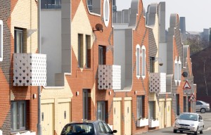
The Islington Square project in Manchester consists of 23 new two to four bedroom family homes and is part of the larger New Islington development by Urban Splash. One of the first steps in the design process was a series of design workshops at which the architects discussed existing conditions with users and photographed their existing housing units to help understand how the units accommodated certain changes over time (e.g. reconfiguring the kitchen, overlaying of personalized decoration) and ways in which they did not (e.g. redefining the circulation path off the living room). This led the architects to provide a quite versatile solution with an L-shaped, open plan configuration which can be subdivided easily and allows for a variety of spatial and functional possibilities. The design also includes high ground floor ceiling heights (2.9m), windows in every space and proportions which allow for a variety of furniture layouts. The stair contains a deep bay window which creates an opportunity to activate the circulation space for other uses (e.g. space for a desk or a piano). In addition, the residents are given open space at the rear to extend their living environment (e.g. conservatory).
The design focused on providing the users multiple ways to use and appropriate the various spaces – starting not finishing the residences. Regulations dictated that every home needed to be provided a parking space, the architects cleverly designed the space to allow for parking or to be used as an additional front garden space. The courtyard like space is defined by pairing two units together and carrying the façade across the front. Residents were allowed to customize elements of the home including choosing kitchen and bathroom styles along with exterior color specifications (e.g. rear exterior façade). The homes are also adaptable via Lifetime home principles (e.g. removable panel between main bedroom and bathroom for hoist, joists trimmed for addition of lift.) While the units are developed as social housing, the fact that they transcend aesthetic stereotypes (they don’t look like 99% of other social housing schemes) provides the residents with a sense of pride and appreciation towards the design and affords a social durability to the design as well.
Images courtesy of Tim Soar and Ed Sumner
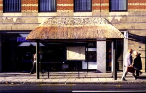
Roadworks explores the temporary transformation of a culturally well-defined urban space (the bus shelter) through new functional and aesthetic possibilities (small art galleries). The premise takes the ad space typically reserved for paying corporations and invites artists to ‘fill’ the space with audio-visual installations. The one month ‘occupation’ tests the idea of architecture’s possibility to change our experience and how we use a space. One example of an experiential shift was the ‘Karaoke Kong’ bus stop which had people actively singing (NYC popup pianos).
Images courtesy of FAT Architecture
Melfi Srl is a construction company representing one of the oldest families in the Italian industrial region of Pettoranello. Their new office building is a symbol of the construction and design quality they stand for, featuring a double-height atrium void with light from above. The concrete framed building used simple building technologies to avoid skill polarization of the local labour market and created a rhythmic solution of orthogonal spaces using a standard 6m grid (versatile and refitable). The exterior wall components (e.g. metal panels, sandstone) are connected using dry connections (screws) and are easily changed if necessary. In addition, the client requested a building which could be architecturally adapted to other uses. Floor loadings have been over-designed to allow for future uses to be accommodated and potential shifts in Italian code laws as well. The building is positioned on the site with consideration to allow for a future horizontal extension (double the volume).
In the six years the building has been in use, several rooms have changed uses (e.g. laboratory to flexible meeting space) and have been joined together by the removal of drywall partitions and doors to support the changing needs of the occupants. The movable wall units and the continuity of floor coverings add to the versatility of the spaces. A legible circulation system makes orientation easy, as well as enhances visual-spatial relationships between the interior and exterior spaces. The lobby is a good example of a large ‘circulation’ space which can be used for events and/ or temporary exhibitions given its large size and natural daylight. The adjacent shed (prefabricated concrete) is currently used for storage, but could be adapted to a variety of uses given its scale, spatial and structural capacity.
Images courtesy of Alberto Muciaccia
The Queens Central Library is currently undergoing a large expansion and modernization process which will transform the library from a closed-stacks system to a more modern open-stack browsing system strengthening it as a cultural and social destination. The addition of the Children’s Library and Discovery Center (CLDC) was the first step in the process providing an adjustable and versatile solution. The lighting, power and ventilation of the large, open spaces are laid out evenly to enhance the versatility of the spaces along with an assortment of non-fixed furniture and movable shelving. The open spaces create loosely bound areas (i.e. ‘soft’ walls) which are used routinely by schools as informal classrooms (e.g. exhibition plazas, reading areas). This is supplemented with a defined multipurpose room which offers a controlled environment for a variety of teaching and lab activities. The perimeter walls have been thickened to promote the use of the large window sills as reading nooks and intimate social spaces. The interior of the building uses colorful graphics to provide additional information including ‘green’ graphics to educate the users about the sustainability features of the project including the use of sustainable (natural, local and recycled) materials and energy and water efficient measures (e.g. lighting and heating). The prominent and centered staircase adheres to the “Active Design Guidelines’ of the City of New York to promote physical activity.
The yet embarked upon renovation of the existing library building is challenged by the need to remain open during the process and the low ceiling heights which demand an innovative HVAC solution. A variety of solutions will be explored to maximize the useable ceiling height (e.g. low air delivery at floor level with return air ceiling plenum). As part of the master plan proposal to make the existing library more open and accessible to the public, a new double height atrium space will be cut into the second floor slab and a large portion of the upper of two basement floors will be removed, both centered around an open staircase connecting each level with a skylight above. The removed floor capacity is balanced by moving the small, closed spaces to an administrative tower which currently is intended to be constructed on top of the CLDC addition.
Images courtesy of OTTO and Michael Moran
The Next 21 project is a unique example of experimental housing centred on highly individualised lifestyles, a high-density urban context and resource conservation conducted by Osaka Gas Company. The building was developed with two main concepts: system building and two-stage housing. System building refers to the building being made up of a series of subsystems which they define based on differing lifespan and production paths (structure, cladding, infill and plumbing). Two-stage housing signifies the separation of the building into two categories: the skeleton (permanent, shared infrastructural property) and the infill (shorter, individual property). The project embraces the idea of a vertical neighbourhood with enlarged circulation spaces referred to as ‘avenues’ and ecological gardens which allow for social interactions and activities to take place vertically throughout the building. The building is a continual experiment documenting the efficiency (time, cost and material conservation) of various changes (e.g. movement of water-related facilities and external walls, addition of Japanese-style room) over the life of the building.
The building consists of 18 individualistic residential units of 140m2 (6 per a level) which were designed by 13 ‘outside’ design teams in addition to the design team which developed the skeleton matrix. The individual units are named after the lifestyles they look to embody (e.g. House with Office, 3-generation house, Home party house). The building is highly coordinated in terms of size and shape of components, performance of equipment, exterior wall line, arrangement of windows and green zones. A rulebook was established so that the building could continually be adapted without the need of the original designers. The generous floor to floor heights (lower level 4.2m, upper floors 3.6m) allow for a quality of openness, but also provide ample space to run all services, greater storage space and space for mezzanine and Japanese-style sunken floors ‘kotatsu’. Kitchen and sanitary facilities can be located anywhere in the building with the use of flexible piping installed separate of the main structure. Changing of the exterior panels can be accomplished from the inside eliminating the need for scaffolding.
Images courtesy of Professor Seiichi Fukao and Osaka Gas
The newly relocated and consolidated campus for Gateway College provides a sense of community and an educational environment fit for the 21st century. The design sought to challenge traditional teaching block layouts and create a sense of ownership by composing individual self-contained ‘pods’ for each faculty housing specialist spaces adjacent to teaching, staff and support areas. Individualised colour schemes and display cases allow the departments to appropriate their wings helping to create an association with and identity for their departments. The ‘street’, a central three-storey link between all faculty wings, provides equal access to all shared facilities (learning resource centre, reception, social space) and generous circulation spaces for annual, temporary and ad-hoc events and activities. The building also includes specialist spaces with separated access and services (e.g. sports hall, performance theatre) allowing certain spaces to remain active ‘after-hours’ for local groups and students. There is external independent access to the sports hall while the theatre is accessed via the internal street.
Barring a level of specialism (e.g. kiln room), the teaching blocks were designed homogenously to allow for expansion and contraction of spaces within the departments, while space was left open to the North of the complex to allow for the blocks themselves to be expanded. A standard grid layout of 4m x 1.5m allows interior partitions to be positioned off grid lines at 1.5m centres and provides the ability to have rooms of differing sizes, set within the pod standard. Power and data points run along a buzz bar underneath a raised access floor and windows are set to a regular rhythm allowing classrooms a capacity to grow or shrink with the easy removal/ addition of dividing stud wall partitions. The theatre spaced contains retractable seating and a high acoustic folding partition allowing the space to be used in its entirety for productions and lectures and as smaller spaces teaching drama and dance simultaneously. The partition wall not only divides the space, but it can also be used as a screen for lectures and a ‘proscenium arch’ for stage productions.
Images courtesy of Nightingale Associates
The new ‘Golden Jubilee’ Wing replaced part of an existing 1913 ‘Florence Nightingale’ hospital offering a prominent, yet integral contemporary addition. The challenge for the design team was to create a building which could accommodate future medical changes on a tight urban site surrounded by a fully operational acute hospital. The large wing consists of a range of departments and services surrounding a striking six-storey atrium which allows departments to be arranged around the perimeter taking advantage of natural light, ventilation and good adjacencies to existing departments. The central atrium contains vertical circulation and service risers along with glazed horizontal links centrally connecting the upper floors allowing for the surrounding floor plates to be densely packed and uninterrupted (a benefit for future versatility). Both the interior and exterior interweave modern and traditional materials and features (e.g. matching stone and brick of existing hospital).
The wing consists of a plethora of solutions to which augment future change. The building was designed as ‘Shell and Core’ separating the structure and services (long-lasting) with the infill elements (short-lasting). A regular, uninterrupted structural grid (7.2m x 7,2m) along with a flat slab containing no downstanding beams and service zones in the structure around each column, allow penetration for future services if required, complemented with an unobstructed ceiling void allowing for future change to be less disruptive. Identically sized floor plates and corridor locations along with generous and consistent floor to floor heights allow departments and wards to be converted easily (e.g. the building started with 3 ambulatory care floors and 4 ward floors and now has 4 ambulatory care floors and 3 inpatient). The convertibility of rooms is enhanced by the window design allowing for 3 conditions (100mm low level/ 300mm on high level restricted, fully operable and sealed). As patient rooms they are currently 100mm/ 300mm restricted, but could be changed to fully operable if the room was converted into an office space. In addition, curtain wall panels could be refitted easily upon aesthetic or functional necessity.
Images courtesy of Nightingale Associates
The Seven Heavens (Zeven Hemels) project was part of the Dutch IFD government initiative which gave funding to projects which provided mass-customizable residential solutions to the public by exhibiting the characteristics of the three initials – industrial, flexible and demountable. Seven Heavens enthusiastically pushed the concept by including a novel steel structural system and a new form of ‘cooperative’ design (with one architect designing the base building and a set of architects selected by the residents each designing one of the seven residential floor levels including the façade for that level). The result was an unknown ‘finished’ product which made it difficult to sell units – no units were pre-sold.
The intent was for the building to accommodate 19 residential units (120m2 ) and a ground floor with a shop and storage for the residents. The steel skeleton with hollow core floors produced a column-free span of 12m allowing for an open plan layout to be designed completely as the resident desired (including the façade). A universal connection detail was designed by the base architect to attach the façade panels back to the structure which allowed for them to be replaced or modified easily at any time. However, the accrued novelty of so many aspects left the project overly ambitious and eventually shelved in 2002 due to scaling costs to realise the project.
De Kersentuin (The Cherry Orchard) began as a resident led initiative to develop a sustainable housing district in Utrecht, Netherlands. The council linked the residents with professionals to map out a plan (housing density, street layout, materials, etc.) consisting of a mixture of 94 residences (28 rental and 66 homes) – small apartments, large houses and commuter homes. As the resident group grew, members had to commit at least a half day of work a week to the housing project, creating a sense of a community and ownership to the project. The real sense of community has allowed for the successful use of several shared facilities such as a car-sharing system, a project house (a multi-functional space for community use), a parking garage (freeing up ground space), a laundry room, an amphitheater, and an internet forum. The community has also embraced several sustainable practices with a nearby recycling centre, collective heating supply, natural ventilation, use of natural and recycled materials, etc.
The timber framed homes are part of the IFD (Industrial, Flexible, Demountable) movement in the Netherlands. The initial residents could choose from a variety of layouts including three locations for the stairs, while the 6m spans, lightweight partition walls, finishes, and equipment systems allow for subsequent versatility during use. The versatility is suited to adapt the homes for the disabled and elderly practical for lifetime adaptations as well. The homes are extendable in the back with additional strip foundations in place and the rear façades being demountable. Connections are made removable and reusable for refitting and disassembly and are designed (recorded) with a demolition plan. In one case of a home owner choosing to extend their home in the rear, the demountable façade was not reused as intended despite the initial investment. The façade was left on during the construction in order to allow the residents to continue to live in the house and was removed (easily) and disposed of upon completion.
Images courtesy of Rob Geraedts
RDIC combines the benefits of rigid containers and inflatable architecture into a hybrid solution for post-disaster, provisional housing. Developed for the NYC Office of Emergency Management after winning the ‘What if New York…’ competition in 2008, the prefabricated compact living units (3 RDIC units = 1 40’ long shipping container) take advantage of quick deployment, flexible arrangements and pre-installed services and stored furnishings. A pre-deployed unit (9m2) expands to (19m2) more than doubling its size and can be joined with other units to form multiple living configurations using knock-out panels located on both side walls with flexible fabric links and steel floor panels (steel pegs inserted in the four corners). A single unit can be used as a studio while combinations vary between 1 to 3 bedrooms with prefabricated kitchen, storage and bath units installed as needed and loose furnishings packed in an unassembled state to minimise space requirements.
Each module is composed of two sections – one rigid (standard structural steel components support up to 8 units above) and one inflatable (two separate layers of translucent fabric allow for ambient light). Connections for services are prefabricated and installed on the surfaces while each housing module has a single point of connection for all services. The rear wall folds down to become the floor for the inflatable portion, lowered in place through the use of a manual crank with folding mechanisms cast into the concrete floor. The walkway connecting housing units rotates down from the front wall and pivots into place with the railing system folding up. In addition to the RDIC units, the proposed solution includes a base unit which can be used for a variety of activities at the ground level to provide essential services to the residential units (e.g. laundry, custodian, storage). The overall configuration of the units can be combined in a variety of ways to accommodate different site conditions.
The original library building, a Nationally registered historic place, was constructed in 1902 from a large financial donation by Andrew Carnegie and a gift of land from Frank Stout. The library purchased the neighbouring land in the 1930s and eventually underwent expansion in 1981. The 1980s expansion brought a contemporary style adjoining space which hid and limited access to many of the original buildings prominent features including the skylights, original reading room and use of its grand entrance. The 2010 renovation (restore and modernize) project has focused on bringing back to live many of those lost features and striking an improved balance between contemporary and historic spaces by reorganizing the way in which spaces are used and moved through, peeling back some of the added layers and inserting new elements strategically. The project under went several fund raising drives which resulted in half of the building being financed from private financiers exemplifying a great local appreciation for the landmark.
Several elements from the building’s original design bolstered the process including proportions of spaces, storey height, natural light, intuitive wayfinding and the hierarchy of spaces taking visual clues from the architecture (light and volume). Many underused spaces were (re)activated including an unused mezzanine turned into an elevated reading lounge and an elaborate central rotunda showcasing a 4 metre light well. The biggest challenge with reinventing how the building is used and circulated through was finding creative ways to move air. An untapped zone between the original building and the addition provided the needed solution to move air sufficiently. The process showed albeit a poorly done renovation from the 1980s, how a well-designed building, designed over a 100 years ago, can be refit easily for modern needs and receive LEED certification.
This new lab and office building was developed as a joint venture between the university and a developer as part of the university’s research park. The building is functionally divided by a common lobby with the large speculative office space to the west and a wing of lab and supporting spaces to the east. The lab spaces provide subsidized rent as start-up spaces for new biotechnology companies providing promising research developed at the university a chance to blossom into a self-sustaining entity. The spaces are not meant to become long-term homes as the tenants are given yearly leases which are non-renewable after three. Along with the lab space, communal spaces are provided which serve as a collaborative environment to allow lessons to be shared and synergies to be exploited between tenants who all face the tremendous challenge of bringing a new product to market. The speculative office space could serve as a new home for the companies after they develop.
Shared amenity spaces such as the lobby, board and conference rooms provide a set of versatile spaces for the nascent companies to hold meetings with investors and offers essential credibility. The lobby adjoins a capacious multi-purpose room with a series of large pivot doors that when open, provide a generous and continuous space which could be used for a variety of events. The labs can support multiple case work configurations and are equipped with standard furniture and equipment which can be added/ removed as needed. Growth or use of multiple labs by a single group was envisioned through the installation of a door between labs rather than knocking the dividing wall down. The building was conceived so that an additional bar could snap on to the eastern edge.
Photo credits: Wayne Johnson, Main Street Studio
In June 2008 a major flood devastated Cedar Rapids pouring water into hundreds of buildings including the 25-year old Public Library and destroying much of its items. As a temporary solution the library refitted a 1,700 square metre space inside a retail mall outside the city centre and opened a small storefront presence close to its downtown home. In search for a new site, the library wanted to maintain a downtown and street-front presence as well as be accessible to public transport. The new site acts as a bookend to the small central park opposite the Cedar Rapids Art Museum. The client side was driven by a young, new director who envisioned moving library services very much into the future, treating the library more as a retail book store than a traditional library.
The T-shaped library has no main circulation area as staff members are filtered throughout the collections at small versatile kiosks. The architects concentrated fixed items (e.g. toilets, staircase, mechanical room) into one area leaving the majority of the space versatile to adapt to a variety of spatial layouts over time. The large open collection spaces are filled with a variety of adjustable furniture and include a wide column spacing of approximately 10m spans. The second floor of the library uses a raised access floor system to run cabling and add in the flexibility of the space. While the large public plaza space in front of the library is designed as a series of plateaus which can be used as tier seating for special events like local parades or marathons and is equipped with electrical power for temporary uses. The majority of the library is cladded as a rainscreen system using swiss pearl panels with exposed fasteners which allow the panels to be switched out easily without disturbing the thermal break.
Images courtesy of OPN Architects, Inc.
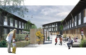
The simple ‘boxes’ which form the Almen+ terraced house residences are based off a traditional Danish archetype and the result of a competition for 240 low price residential units for the social housing corporation AKB. In order to bring down costs the scheme is entirely based on prefabrication and as a result the project is developed in close collaboration with a manufacturer of volumetric elements. The system developed is changeable to different sites and programmes and is defined by measures suitable for transportation with a maximum module of 3.6 m. The ‘completed’ building is constructed without any interior partition walls or finished painting to help reduce rental costs.
Despite limited manoeuvres for spatial composition high priority was given to ensure a variety of spatial plans could be achieved by the residents. The 3.6 m module is wide enough to generate a versatile space and hence kitchen, living room and sleeping rooms are able to be configured into a number of combinations. Albeit not owning the homes, occupants can choose to individually invest in additional componentry. The window openings of the façade are all alike but can be ‘filled’ differently varying between full glazed partitions, French balconies, ordinary windows and blinding panels. Furthermore, the cladding boards of the façade are mounted with frictional fixations avoiding penetration of the board material in order to ensure easy dismantling for refurbishment or replacement.
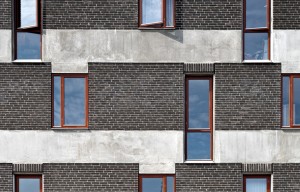
The Aeblelunden (Apple Grove) housing development consists of a single building of seven stories containing 91 flats ranging from single to small family dwellings. The residences were designed to be low priced condominums with the possibility to choose from five degrees of completion from open floor plans with untreated surfaces to a completely finished solution. The floor plans are versatile (no load bearing partitions) within the apartment, but lack the ability to combine units given the load-bearing walls between units. Kitchen and bathroom units remain relatively static given the volumetric solution used, but material surfaces and items can be customized.
In order to demonstrate the versatility of the apartments the architects tested the concept among their own staff by having ten architects compose customized plans if they were to live there themselves. The varied results were handed out to the buyers as inspiration. None of the designs showed much similarity with the compositions generated from the real estate agents which were offered along with the DIY option. Variation in the façade is created by utilizing the gaps between the concrete sandwich panels for window openings reducing the calculable area of the concrete which could help finance the complex jointsof the panels. The design approach suggests an alternative way of distributing design competencies by maximising interior customisation to the user while restricting the façade or building’s public ‘interface’ to the architect.
The newly constructed school was driven by an informed client asking for change, creating a shift in learning models to establish small learning communities (SLC) along five guiding principles. The building materialised as four independent SLCs connected to a central commons campus. The programme was distilled down to 13 spatial types defined by size, volume, number of occupants and services, and applied across a matrix to illustrate how they could support over 150 different subject orientated programme spaces.
The design intent was for the building(s) to adapt over time spatially and identity-wise. The process included such scenario-based design techniques as a ‘Day in the life’ and ‘Powerful Moments’ to help capture how the building would be used and would need to accommodate change in usage patterns, high school programs and curricula. As an example, this led to creating a ‘school without corridors’ as spaces between ‘classrooms’ get used as open learning and project labs architecturally delineated through flooring materials, columns and ceiling soffits. Both interior and exterior graphics are able to change easily to support the ability for the SLCs to redefine themselves.
Image credits: Images courtesy of DLR Group
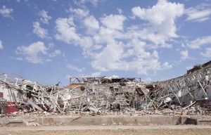
In May of 2011 a tornado flattened the existing Joplin High School and left 1,200 students without a home for the following school year. It was quickly determined that an existing ‘big box’ retail building constructed in the mid-80s and left vacant for over 10 years would be a suitable site to convert for an interim school building. The intent is for the school to occupy the building for three years which set forth particular design considerations towards which elements would be movable into the new school (e.g. carpet tiles, swing gate doors) and which elements could be reused for a following tenant (e.g. job training, adult education).
The large open space (9m x 9m column spacing, 4.3m floor to ceiling height) and a mechanical system sufficient to meet the increased occupancy load allowed the designers to provide the school with a wide range of versatile spaces for a variety of educational and social activities. Material, spatial and solution choices provoke the users to appropriate the space providing a sense of ownership and identity with the building lending them more likely to both adapt the space and/ or themselves to fit their evolving needs.
Image credits: Images courtesy of DLR Group
Dentsu is the largest advertising agency in Japan (over 7,000 employees) and its headquarters occupies a 48-floor skyscraper designed by French architect Jean Nouvel. The company has put together a project team of young, enthusiastic employees to explore alternative, transient uses for the entrance lobby changing its appearance, use and spatial organisation every month over the period of one year. The initial month brought together designers Megumi Mastubara and Hirori Ariyama (Assistant) and Bach to engage the users with the company’s publications.
The concept was for the employees to take ownership of the ‘library’ asking them to choose their favourite publications and to bring them in to be included in the entrance library. More than 500 books brought in by over 100 employees were included in the installation. The library – shelves, tables, chairs – was all ‘packed’ air, designed with transparent packaging materials. The packaging material takes ‘care’ of the books during their transport and also creates a resting place for them and the user as part of the entrance lobby. The total amount of material used can be deflated and fits within 1m² of space allowing for easy storage to be used again or to be recycled.
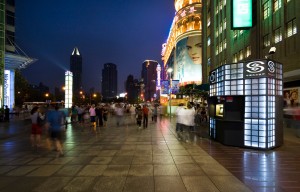
The 12 kiosks are located on Nanjing Road in Shanghai nicknamed ‘number one Street of China’ signifying its commercial significance in China’s modern history. The road stretches a mere 1 km, but attracts over a million visitors a year despite its chaotic order. As part of the government’s regeneration plan for the area, the kiosks are strategically themed, varied and situated a 100 meters apart amplifying the unique urban landscape with their art-deco inspired glass panels emulating the historic architecture of the neighbourhood. In addition, the roofs support solar panels supplying the exterior LED lighting.
The kiosks even in their small scale are ‘mixed-use’ hosting a variety of hybrid uses providing public services (e.g. tourist information, souvenirs, lottery) and/ or commercial services (e.g. Madame Tussaud’s Wax kiosk, Coca cola). While the general shape and structure of each kiosk is the same, the skin of the kiosks reflect the given programme of that kiosk representing differences in materiality, openings and how the user interacts with the kiosk. The kiosks can change use quickly given the refitability of the panels and simplicity of the selected construction method.
c-MA1 involved the conversion of an 18-year old office building in central Tokyo, formerly a photo studio, into three residential units and an office suite. At the time of the project in 2003, the market for conversions in Tokyo was small; however the developer realized a potentially emerging market with several similar office buildings that were vacant in the city. Residential use was a profitable market conversion because living space was at a higher premium in that area than offices (original use), and more residential floor area could be added as an incentive for residential development offered by the local government.
The architect’s design approach was to enhance the characteristics of the original building (e.g. provide a higher floor height for residential use). The team attempted to drive market value by emphasizing the uniqueness offered by the original characteristics – taller floor heights of rooms (4.5m and 3.8m) and split floor levels with small stairs linking the spaces. Exposing the features of the original building was also intended to enhance users’ experience – blending the new with the old.
Mokuzai Kaikan (MK) relocated the offices of the Association of Wood Wholesalers and was designed as an innovative prototype for urban wooden offices based upon earlier traditional structures such as temples and shrines, which aimed to revive this culture in Japanese architecture. Traditionally, the (wooden) structure is made only by timber without steel, concrete, or wet connections (e.g. glue) and is based on a single module – to ease changing layouts and componentry. In MK the use of some structural steel parts could not be avoided, but they are removable, being fastened through dry connections. State-of-the-art computer modelling and manufacturing technology (CDC, numerically controlled cutting) was needed to develop the low tolerances for such a precise solution for both structure and façade.
MK utilizes a ‘universal space’ which they signify through a column-free work space. The designers of MK activated the external periphery of the office space to create a strip of more casual and semi-open air spaces connecting the office space to the outside environment. In addition, the use of Engawa, Japanese terraces, helps provide a comfortable indoor environment by allowing cool breezes to enter while shutting out direct sunlight.
Takenaka Corporation constructed its Tokyo headquarters in 2004 (33,000m2 and 7 stories) with three major themes: 1) high efficiency (a high quality work place for employees); 2) green building; and 3) low cost solution (initial and total life cycle cost) (Figure 4). The implementation and convergence of these three aspirations turned the conventional office layout inside out by positioning more static core spaces along the periphery and opening the center up for communication and interaction, allowing the design to accommodate ongoing changes in office operations and environment. The dispersing of the centralized core created an open solution allowing for continuity (visual connection and access) between floors, spaces and nature through large light wells.
A key tactic was shifting to a 10.8m uniform-grid offering a low cost solution, which is typically used for shopping centres and parking – in contrast to the typical office span of 16-18m. The reduced column spacing is accompanied by external lateral bracing that creates a rigid shell and allows for a free internal space that was envisioned to incorporate future changes in use (e.g. a hotel or shopping centre). The openness of the space is complimented by a storey height of 4.1m with an open and protruding ceiling ranging from a minimum of 3.1m in height to a maximum of 3.8m providing a good acoustical environment.
The original manufacturing building was purchased by the NYC Board of Education to warehouse records, but over time as a scarcity of building sites has occurred they’ve converted the 8 storey building (16,700m2) into four separate schools. The last of the four is The Urban Assembly School of Music and Art occupying the top two floors and catering to 432 students. The smaller high school format follows a more specific programme of study (e.g. art & music) in addition to the required high school curriculum.
The exposed concrete construction, existing skylights and large window surfaces all lent themselves well to the conversion process; while the rigidity of the structural grid, vertical penetrations and providing an independent mechanical system posed cost and design challenges. Going against a trend of over-finishing internal spaces, the colour/ finish scheme was strategically applied to allow for spaces to be appropriated (continually adapted) by its users. Simple white wall and ceiling surfaces within the corridor areas with gypsum wall recesses provide wall surfaces for student artwork to be displayed and where colour is used it is a single colour over a large enough area so that an ‘overlay’ of artwork or graphics can be applied.
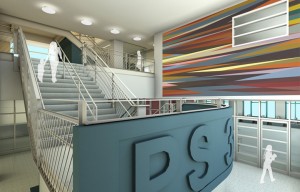
PS340 is the partial conversion (lower six floors of a 14 storey high-rise) of a 1989 hospital building situated in the centre of NYC. The remaining floors above will remain in hospital use for non-acute medical care and administrative offices, while the remaining medical services have moved out to a new building outside the city which is tailored to the technology advances in patient treatments. The split use of the building has required separate access with the hospital’s entrance on the main road (6th Avenue) and the school’s along the quieter 17th street which helps to mitigate the dense urban conditions for a primary school.
The building bulk, orientation and structural module of the existing building accommodated the school program well, while the 2008 building code revisions played a constraining role in the conversion process particularly for life safety systems in a high-rise building (e.g. fire alarms, shared egress paths). ‘Niches’ along the corridor space serve as break-out spaces for small class groups as well as allow an increase of natural light to flow into the central spaces. The vertical layout of the school works well to accommodate community use during off hours allowing the large, shared school spaces in the cellar, ground floor and second floor to be secured from the classrooms above.
The Verbus system is a patented technology for a modularized structural system that takes advantage of low cost manufacturing utilizing factory produced volumetric modules based on shipping container technology that can be combined to create a variety of building shapes and deliver a high strength structural solution. The system is applicable for moderate high rise cellular accommodation type buildings (i.e. hotels, dormitories, etc.) up to 16 stories in height and can be erected quickly using specially developed locking mechanisms. Typically, the ground and top floors along with vertical circulation are fitted out with conventional construction methods.
The modules form the bulk of the building which can be primarily finished off-site in China and shipped to their destination ready to be installed. The cladding and services are typically done on-site interfacing directly with the modules. External facade features such as balconies are easily incorporated either through external fixings or through drop down panels. With proper planning the use of the volumetric modules along with the standardised shapes and components allow for the building to be scalable and its components refittable. To date, the Verbus System has built several hotels in the UK (e.g. Travelodge) along with a few international projects.
The Sunderland Gateway designed by Faulkner browns was commissioned by the University of Sunderland so that they could fit all of their student services into one building. This building is the refurbishment of an old concrete structure and budgetary constraints meant that the university couldn’t at the time afford a new building. The building is organised over three floors, the ground floor includes all accessible services such as careers and accommodation and a small café. The second floor is an open plan office for all of the different service teams and the top floor is a mixture of classrooms and meeting space. The building was designed to be versatile due to the varied uses throughout the year; there is a removable wall on the third floor that is taken down at different times in the year when the staff need a large space to work. The ground floor is also very versatile with different services changing around to suit the needs of the students.
The Montpellier Chapter hotel designed by MAKE architects is the latest refurbishment of a hotel that has changed over six times in the last century. This refurbishment incorporates and unifies the grade two listed existing building with contemporary new amenities. Since it was first built as a private villa residence in 1847, the building has had numerous extensions, many of which lacked clarity and care and progressively eroded its character and aesthetic. The Grade II listed building became a hotel at the turn of the 20th century, and is located in the Bayshill Estate Conservation Area within the chic Montpellier district of Cheltenham. Under the client’s brief of ‘Contemporary England’, the vision was to resuscitate the building’s time-expired accommodation, simplify circulation and extend the building with contemporary additions, transforming it into a luxurious new destination hotel. The building has already been proven to be adaptable, having stood the test of time, this new extension is built in precast concrete in order to be as durable as the existing building and it is hoped that it will last as long.
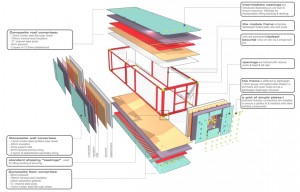
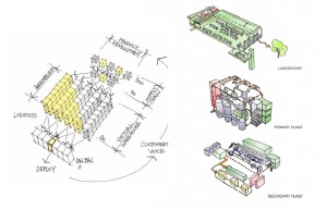
The Newways project was developed by Bryden Wood McLeod (BWM) for Glaxo Smith Kline (GSK), a multi-national pharmaceutical company, as an innovative way of designing, procuring and constructing the basic elements of a building to cut the construction time of their facilities from 24 months to 13 weeks. The demand for a reduced construction time is generated by the nature and risk involved in the way the pharmaceutical industry operates. The intent is for the system to encompass the three types of facilities they manage (laboratories, primary and secondary production) through the reconfiguration of system componentry. The building was designed so that it could be decomposed into a set of assemblies, components, and parts.
The system uses a basic kit-of-parts approach comprising of 900 parts, 90 components, and 30 assemblies. The formula used on a project basis is a 10/80/10 approach where 80% of the parts would be standard, while 10% would be specific to the given program and 10% to the specific site context. The off-site manufacturing allows the system to take a product design approach and have many of the elements developed in parallel. The system incorporates floor cassette units (4m x 12m) which fit the 12m x 12m structural grid, are delivered with attached services (e.g. cable trays, ductwork connections) and uses simple on-site ‘hook & eye’ connections for quick assembly (16 per a day). The exterior fabric will be delivered as a series of mega panels that interface with the floor cassettes and can be cladded with a variety of systems and sealed with a zip-p gasket.
BT Brentwood was a result of work style 2000, a BT workplace initiative which started in 1993, shifting spatial plans (from cellular to open plan) and geographic locations (from inner city to the outskirts) offering higher ‘quality’ workspaces. The building is located on the 22 ha former site of St Faiths hospital near the town of Brentwood. The area now owned by BT is in the region of 5.7ha, with open green belt land to the north comprising the additional 14.7ha of the original site. The building is predominantly office space (3 floors) with a restaurant space, two conservatory gardens and a split level car park built to accommodate 800 vehicles.
BT wanted to balance a building specific to their needs with a building generic enough to be appealing for future lease or sale. The horizontal building can be separated into 3 ‘wings’ each with their own entrance and service zone that can be controlled separately. The large variety of rooms has proven very useful as departments and teams have shifted throughout the building depending on their current needs. Over time the building has seen a simplification of how spaces are used and managed removing many of the features and static uses that were once believed to be a necessity (e.g. personalised space, first aid rooms).
The Nottingham Science Park is a boutique office development constructed by the developers Blueprint and designed by the architects Studio Egret West. Completed in 2008, this environmentally friendly office building is built on the former Beeston railway sidings which are now flourishing with an array of flora and fauna. Lifting the building off the ground gently came naturally to the designers given the flood plain and allowed the design to camouflage the parking underground and embrace its surroundings. Likewise, the exterior space(s) has been developed for the users to enjoy their surroundings with places to sit and routes to walk.
The building was designed to be adaptable in many ways including looking the shared entrance at the centre and allowing the subdividable office spaces to form two wings which can be carved up in a number of ways. The development offers a range of options in terms of space (1000 to 20,000 Sq ft sized offices), fit out (from grade A office to bespoke solutions from shell & core to full lab spec) and leases (flexible lease terms to suit individual requirements). A number of the social and work facilities are shared spaces offering versatility to the space both in how they are used and by whom. The façade panels are a laminated timber which are durable, easy to clean and can be refitted easy do to the dry connections used.
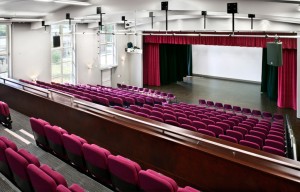
The Sainsbury Centre for Visual Arts was funded by Sir Robert and Lady Lisa Sainsbury to house their donated collection of ethnographic and twentieth-century art. The Centre is located at the University of East Anglia (UEA) as they wanted it to have an academic and social focus. As well as housing the Sainsburys’ permanent collection there is also a temporary exhibition space, entrance conservatory, café, restaurant, School of World Art Studies and Museology and a library. The Crescent Wing addition was created in 1988 to provide space for the reserve collection, conversation facilities, offices and a gallery for exhibitions and conferences and was then connected to the main building in 2006 providing additional display space, studio spaces, improved shop facilities, a café and other visitor facilities such as the new education centre.
Norman Foster was commissioned to the design the building, which is a linear open-plan space created by using a prefabricated steel frame which provides a 35m span of open space by 135m in length. The services are housed in a double layer wall, in the ceiling and in the basement corridor – separating served and servant spaces. The large open space provides the client with complete freedom strengthening the versatility of the space with the use of movable study rooms, partition screens, display cases, and stands. In addition, the centre was constructed from a kit of parts solution utilizing five types of aluminium cladding: flat glazed, solid or grilled, and rounded solid or glazed.
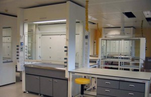
GlaxoSmithKline (GSK), a large pharmaceutical company, developed FlexiLab to help respond to the changing nature of research methods and the expensive reorganization of its laboratories which were limited by fixed configurations. The concept combines open floor plans with movable equipment and modular services to create an adjustable and versatile space. It allows the scientists the capacity to move their working units (fume cupboards, LEV containment units, benching, etc.) on wheels based on their immediate needs throughout the space as all services are fed from above through a standard ceiling grid with colour coded connections for the different services via flexible cords with quick ‘plug and play’ service connections.
The solution relates to the stuff, space plan and service layers of the building including relocatable glass walls that help with contamination and security and promote communication amongst the users. Components can be refitted easily and it takes about a day and a half to fit out an entire space which can be done by the users themselves. The system has been adapted to be used by researchers in a variety of disciplines and has reduced costs for GSK dramatically from £1.8 to 3k per m2 and increased occupancy capacity from 12-14 to 22 or more per a lab.
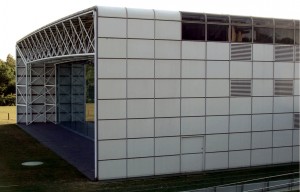
The building(s) (four square blocks each with their own central courtyard) is comprised of a factory, warehouse, testing facility and office, housing the headquarters for Igus, a ‘high-tech’ plastic products manufacturer, which produces thousands of new products every year lending itself to a rapidly changing programme and requiring the production facilities to be constantly re-configured. The building’s design gives the capacity to change the internal factory layouts rapidly and frequently and also allow for the building to be scaled either larger or smaller in halves depending on the company’s every changing business needs. Over the 17 years, the facility has grown from 4,500m2 to 20,000m2 in size.
An open-lattice steel mast structure (spans of up to 33m) enables column free spaces that are interchangeable between factory and office use to include multi-functional pods designed to be moved from place to place. The exposed services are easily accessible, maintained and changed located overhead to avoid disturbing the manufacturing process. Changes to the façade have been done often to correlate with internal layout changes and can be done by simply loosing and turning the aluminum clamps that are secured to composite mullions. The grid used for the cladding (2.25m wide x 1.05 tall) is coordinated with the internal square blocks and bay dimensions and can incorporate a variety of finishes and elements including solid insulated aluminum panels, operable insulated double-glazed windows, louver panels (for ventilation & services) and a variety of door types.
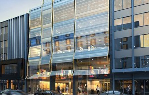
42 rue du Rhône is a major refurbishment project located in central Geneva, creating two levels of retail, five office floors and a rooftop restaurant across four existing basement levels and eight upper floors. The building’s outdated facade has been entirely replaced with undulating glass taking its reference from the mountains of the Swiss region. Occupying a prime location on the exclusive Rue du Rhone, the desire to reduce the construction period and rent loss was significant driver for the client, which coupled with a restricting city centre site and public underground access led to the decision to retain and refurbish rather than redevelop.
While the building maintains its original use as a prime retail and commercial space, both the spatial arrangement and structure have been substantially adapted. The retention of the existing buildings restrictive floor to ceiling heights commanded creative solutions from the designers to ensure the servicing required of a exclusive development could be incorporated, as well as, the existing structure itself had to be substantially reengineered to allow the addition of a striking atrium in a space previously occupied by a cinema to bring light into the lower retail levels. Some features, such as the attractive old cinema steps, have been retained creating feature points among the rejuvenated retail areas.
Retail space occupying the lower levels has been created with maximum spatial planning flexibility, locating only sufficient walls as required for fire regulation purposes allowing the client to let the space in a way which most suits their clients and the market. Similarly the open plan office levels sit behind a repeating 3m facade pattern that permits subdividing and portioning should this be required at a later date.

